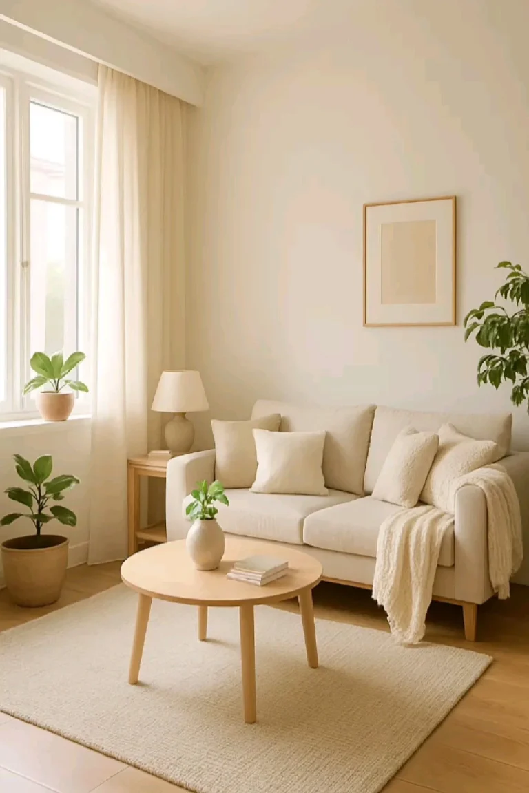
How to Choose Curtains to Match Wall Color
Finding the perfect window treatment doesn’t require a degree in design, but it does require a sharp eye for detail. Learning how to choose curtains to match wall color effectively transforms a room from disjointed to professionally polished.
As of 2026, interior design standards prioritize the tonal balance of a space over strict color matching. You'll achieve the best results by focusing on how light interacts with your wall paint and fabric choices.
Quick Answer
Select curtain colors to complement or contrast your existing wall paint. Aim for a shade slightly darker than your walls for depth. Neutral fabrics create a seamless, sophisticated look in any room.
Avoid exact color matches that make walls look flat. Test fabric swatches in both morning and evening light conditions.
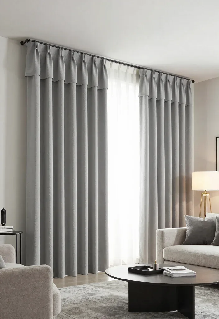
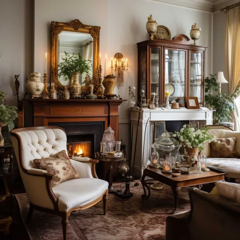
Image source: Web (Bing) / sleeprism.com (Web image (fair-use with source credit))
The Psychology of Color: Why Wall-Curtain Harmony Matters
Your walls provide the canvas for your room, and curtains act as the frame. When the colors don't talk to each other, the space feels chaotic or unfinished. Most designers aim for visual flow, which means the curtains should feel like a natural extension of the wall rather than an interruption.
If you choose a color that is too similar to your wall, the window can disappear entirely. Conversely, choosing a color that is too stark creates a visual barrier that stops the eye. You want your curtains to add depth and dimension to the room.
Think about the temperature of your space before choosing a hue. Warm-toned walls benefit from curtains that lean into earthy or sunset palettes. Cool-toned walls often look best with soft blues, grays, or crisp whites.
This simple alignment makes the entire room feel intentional and grounded.
Decoding Light: How Directional Sun Affects Your Fabric Choice
Light is the most significant variable in color perception. A fabric sample that looks perfect in a store might turn muddy or overly bright once it is hanging in your home. This happens because the orientation of your windows changes the color temperature of the natural light entering the room.
- North-facing windows: These receive consistent, cool light throughout the day. Your walls and curtains may appear slightly blue or gray, so choose warmer fabric tones to prevent a sterile, chilly atmosphere.
- South-facing windows: These spaces get intense, golden light. You have more freedom here, but deep, rich colors often perform better because they can handle the brightness without washing out.
- East and West-facing windows: These get dramatic light shifts. You'll see drastic changes between early morning and late afternoon, so prioritize versatile mid-tone fabrics.
Check your wall paint manufacturer specifications regarding Light Reflectance Value, or LRV, to see how much light your walls bounce back. Higher LRV walls need more grounded curtain colors to keep the room from feeling like a light box.
The Role of Texture and Sheen in Balancing Your Palette
Texture is often overlooked, but it is just as important as the actual color of the fabric. A flat, synthetic curtain can make a room feel cheap, while a textured fabric adds a layer of sophistication. When your walls are a solid, matte paint, a textured curtain provides necessary visual interest.
Consider the sheen of the fabric relative to your wall finish. If your walls have a satin or semi-gloss finish, avoid shiny silk curtains, as the overlapping sheens can look overwhelming. Instead, pair high-gloss walls with matte, heavy-weave fabrics like linen or cotton blends to create a balanced look.
| Fabric Texture | Best Wall Type | Effect |
|---|---|---|
| Linen | Matte, Flat | Adds organic, breathable depth. |
| Velvet | Eggshell, Satin | Creates a moody, high-contrast focal point. |
| Sheer | Any | Softens harsh light and adds elegance. |
| Sateen | Flat, Low-sheen | Provides a subtle, refined highlight. |
Step-by-Step: Evaluating Samples in Your Unique Space
You should never finalize a curtain purchase without seeing a sample in your actual room. Tape a swatch to your wall right next to the window frame. Leave it there for at least 24 hours to see how the color changes as the sun moves across the sky.
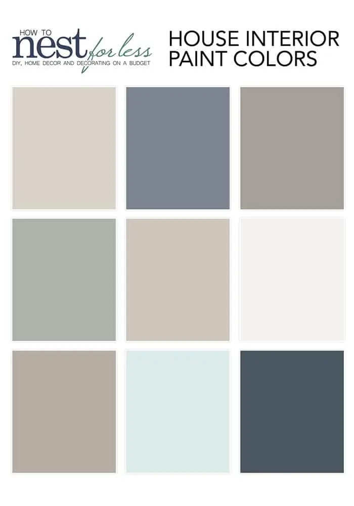
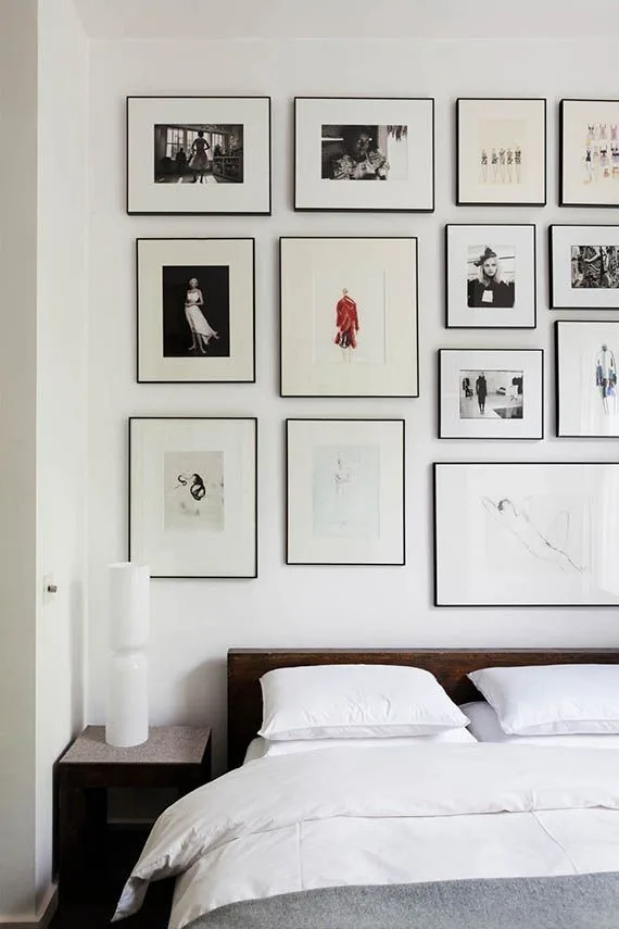
Image source: Bing (Web (fair-use with source credit))
Pay attention to the undertones of your wall paint. Even white paint often contains subtle hints of yellow, blue, or pink. If your walls have a yellow undertone, a gray curtain with blue undertones will look dirty or bruised.
Always look for curtains that share the same base pigment as your walls.
- Order 3-5 swatches in slightly different shades.
- Place them against the wall near the window.
- Observe the fabric at noon, sunset, and under artificial lighting.
- Remove the ones that clash or disappear against the wall.
- Select the sample that provides the best contrast or harmony.
Avoiding the "Room-Shrinking" Trap: Scaling and Mounting Secrets
Mounting your curtains correctly is as important as the color you choose. Many people make the mistake of mounting rods directly above the window frame, which cuts the wall in half and makes the ceiling feel lower.
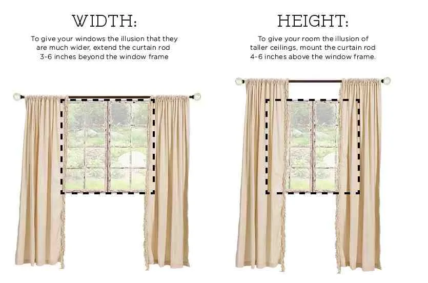
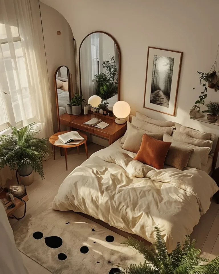
Image source: Bing (Web (fair-use with source credit))
Follow the "high and wide" rule to keep the room feeling spacious. Mount your rod at least 6-10 inches above the window frame, or even closer to the ceiling for a dramatic look. Extend the rod 8-12 inches beyond the window on both sides.
This allows the curtains to hang against the wall, not the glass, which maximizes the perceived size of the window.
If you have a small room, avoid heavy, dark-colored curtains that cover the entire wall. Instead, opt for floor-to-ceiling panels that match the wall color closely. This creates a monochromatic vertical line that draws the eye upward, effectively increasing the perceived height of the ceiling.
For further guidance on room measurements and spatial planning, you can consult resources from NIST regarding interior space standards.
Side-by-Side: Matching, Contrasting, or Going Neutral
Choosing between matching, contrasting, or neutral curtains depends on your vision for the room's energy. A matching approach creates a soft, monochromatic room that feels incredibly peaceful and high-end. Use this method if your walls are a unique, custom color you want to highlight.
Contrast is better for rooms that feel too static or flat. By choosing a curtain color that sits across the color wheel from your wall paint, you inject instant life into the space. A navy blue curtain against a soft gold wall is a classic, punchy combination that forces the eye to focus on the window as a feature.
Neutrals are your best friend if your furniture and rugs are busy. Cream, beige, charcoal, and soft white curtains act as a visual palette cleanser. They don't fight with the wall color and they rarely go out of style, making them a safe long-term investment for any home.
Troubleshooting Common Style and Coordination Errors
Mistakes often occur when homeowners prioritize the look of a fabric over its physical relationship to the wall. The most common error is choosing a fabric that is the exact same color as the wall but in a different shade. This results in an "almost matched" look that just feels like a decorating accident.
Another issue is ignoring the scale of the pattern. If you choose a bold, large-scale print, it can overwhelm a small room with plain walls. You’ll want to stick to a subtle texture or a small, repeating geometric pattern if your walls don't have enough presence to anchor a massive design.
Avoid the "floaty" look by ensuring your curtains are wide enough. Even if you never intend to close them, they must be wide enough to cover the window plus a few inches on each side. Otherwise, the fabric looks like a limp strip of ribbon that fails to frame the window properly.
Frequently Asked Questions
Do I need to match my curtain rod to my wall color?
You don't need to match the rod to the wall. Most designers prefer to coordinate the rod finish with other metal accents in the room, like light fixtures or cabinet hardware. A dark bronze or black rod creates a strong, clean line that defines the window boundary against light walls.
How do I stop curtains from making my room look small?
Avoid dark, heavy fabrics that cover too much of the wall space. Instead, use floor-to-ceiling panels in a color similar to your walls to extend the vertical line of the room. Mounting your rod closer to the ceiling rather than the window frame will also create an illusion of height.
Are sheer curtains ever a good choice?
Sheers are excellent for layering, especially in rooms where you want natural light without the harsh glare of direct sun. Use them as a base layer behind heavier curtains to give you control over both privacy and light levels. They soften the transition between the wall and the outdoor view.
Can I mix different curtain colors in the same room?
You can mix colors if you maintain a consistent fabric weight and texture. If you have multiple windows, using two colors from the same palette can create a custom, tailored feel. Ensure both colors share the same undertones so they don't fight each other visually in the same space.
When should I use thermal curtains?
Use thermal or blackout curtains when you need to manage heat gain or loss, particularly in bedrooms or west-facing rooms. While they are usually heavier and darker, you can find them in lighter neutral shades that complement soft wall colors without sacrificing their insulating performance.