How to Mix Colors in Home Decor
Learning how to mix colors in home decor is essentially about creating a visual conversation between your walls, furniture, and accents. You don't need to be an artist to build a space that feels intentional, balanced, and welcoming.
By using basic color theory and consistent proportions, you can transform any room into a cohesive living area. As of 2026, most design professionals lean on standardized color systems to ensure that shades remain harmonious regardless of the specific paint brand.
Quick Answer
Knowing how to mix colors in home decor requires simple, reliable systems. Start with a dominant neutral base color for your room. Add a secondary color for larger furniture and textiles.
Use a vibrant accent color for small, replaceable decor pieces. Maintain balance by following the 60-30-10 percentage ratio. Test samples in your home light before buying paint.
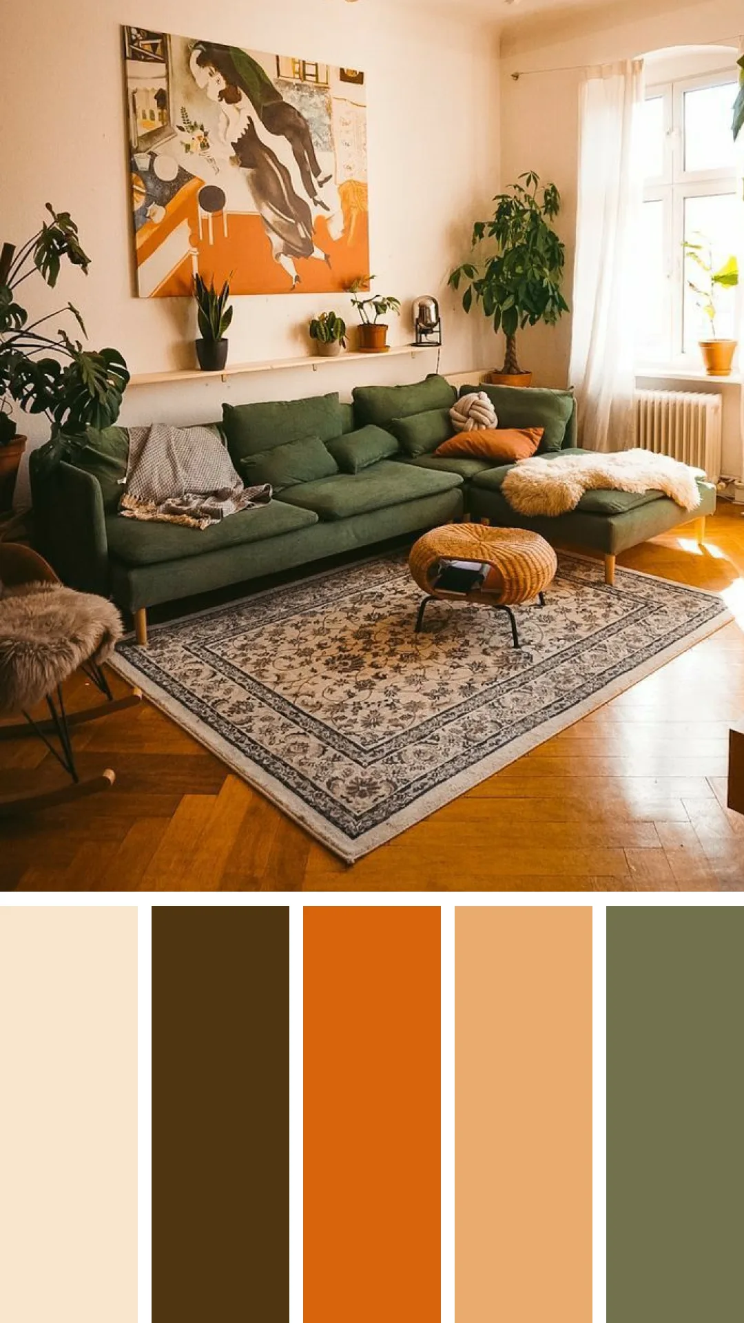
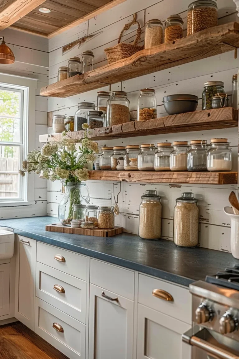
Image source: Web (Bing) / mx.pinterest.com (Web image (fair-use with source credit))
The Secret to Harmonious Color: Why Your Room Isn't Working
If a room feels off, it is rarely about the colors themselves. It is usually about the relationship between them. Many people make the mistake of choosing colors that compete for attention.
When you pack a space with too many high-intensity hues, your eyes have nowhere to rest. Cohesion comes from planning how your surfaces interact. Think about the way your floor, walls, and ceiling act as the stage for your decor.
If you are just starting, limit your palette to three or four colors max. This prevents the visual noise that makes a home feel cluttered. You can check the International Interior Design Association for industry standards on how these spatial relationships impact human comfort.
Mastering the Color Wheel Without the Stress
The color wheel is the most effective tool for understanding how different hues interact. It breaks color down into primary, secondary, and tertiary categories.
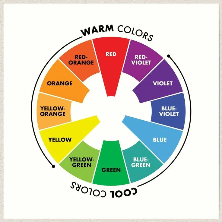
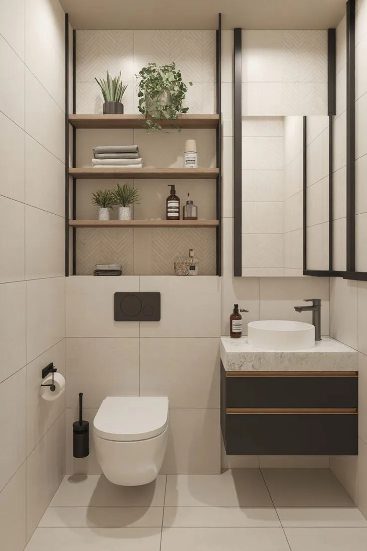
Image source: Web (Bing) / pinterest.com (Web image (fair-use with source credit))
You can use these three schemes to guide your choices:
- Monochromatic: You pick one base color and use its various tints and shades. It creates a serene, high-end look that is almost impossible to get wrong.
- Analogous: You choose colors that sit right next to each other on the wheel. These combinations feel soft, natural, and very easy on the eyes.
- Complementary: You pick colors directly opposite each other, like blue and orange. This brings high energy and drama, so use it carefully in high-traffic rooms.
The 60-30-10 Rule: Creating Visual Balance
The 60-30-10 rule is the gold standard for distributing color across a room. It keeps your space from feeling lopsided or overwhelming.
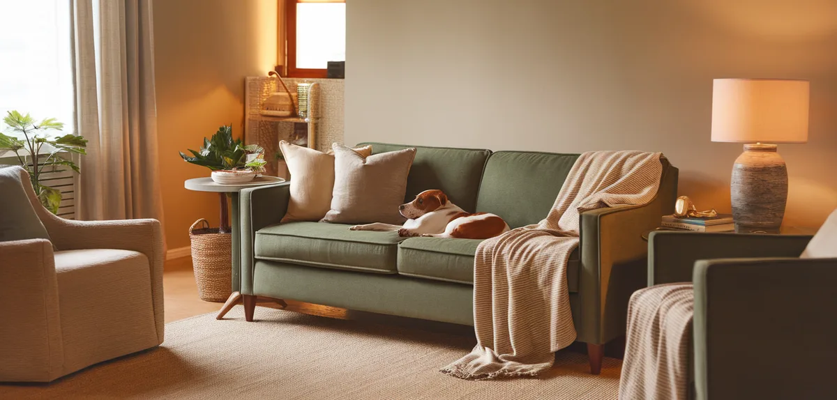
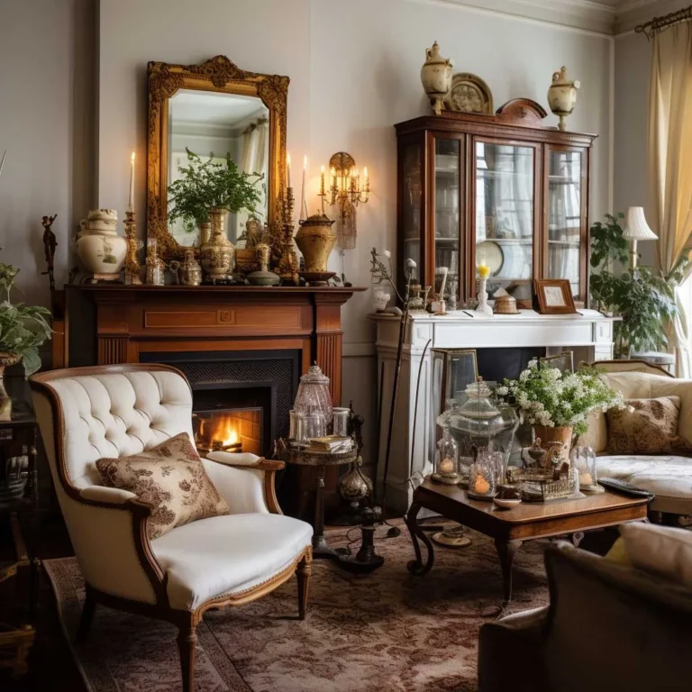
Image source: Web (Bing) / ahomefy.com (Web image (fair-use with source credit))
Here is how you apply it to your space:
| Category | Percentage | Placement |
|---|---|---|
| Dominant | 60% | Walls, large area rugs, and big furniture pieces. |
| Secondary | 30% | Upholstery, drapery, or painted accent walls. |
| Accent | 10% | Throw pillows, wall art, lamps, and small decor. |
This formula ensures that your eye follows a natural path around the room. The dominant color grounds the space, while the secondary color adds interest. The accent color provides that final spark of personality.
The Lighting Factor: How Sunlight and Bulbs Change Everything
Color is not a permanent property of an object. It is a reflection of light hitting that object. This is why a swatch that looks perfect in a store often looks wrong in your living room.
Natural light changes throughout the day. North-facing rooms often have a cool, bluish light that can make grays look purple. South-facing rooms get warm, intense sun that can wash out pale colors.
You must also consider your artificial lighting. Bulbs are measured in Kelvins, and their temperature dictates how your paint will appear.
- 2700K, 3000K: These warm, yellowish bulbs will enhance warm paint tones.
- 3500K, 4000K: These cooler, whiter bulbs will keep colors looking sharp and true.
Always buy sample boards and move them around your room. Observe them at 8:00 AM, 2:00 PM, and 8:00 PM. If you don't like the color in every light, skip it.
Adding Depth Through Texture, Undertones, and Neutrals
Sometimes a room feels boring even when the colors match perfectly. This is usually a sign that you need to add more texture.
Texture is the secret weapon of professional designers. It provides visual interest without needing another color. Mix rough materials like linen, jute, or reclaimed wood with smooth ones like glass or polished metal.
Watch out for undertones when picking your neutrals. A white wall isn't just white. It can have a yellow, pink, or blue undertone.
If your sofa has a cool gray tone, don't pair it with a wall paint that has a yellow, creamy base.
Check your items in natural light against a piece of plain white printer paper. You will immediately see if your neutral leans warm or cool. Keeping those undertones consistent across your room will make the space look like it was finished by an expert.
Common Color Mistakes and How to Fix Them
You can avoid the most common design pitfalls by checking your work before you commit to permanent changes. Many people fall into the trap of over-matching their decor items. You do not need your rug, pillows, and curtains to be the exact same shade of blue.
Instead, look for coordination. You want different textures and slightly varied tones of your chosen color to create interest. If you find your room feeling flat, it is likely because everything has the same level of intensity.
Another frequent error is the museum effect, where a room is perfectly color-matched but lacks life. This happens when you ignore the need for a bridge color. A neutral like charcoal, cream, or soft taupe can help connect two bold colors that might otherwise clash.
If you are struggling with a room that feels busy, try removing one or two accent items. You might find that the room needs less color rather than more. Always remember that negative space is a functional part of your design.
Frequently Asked Questions
How do I fix a room that feels too cold or sterile?
You can warm up a room by introducing textiles with warmer undertones like terracotta, gold, or wood grain. Swap your cool-toned light bulbs for ones in the 2700K range. Adding natural elements like jute rugs or wool throws will also take the edge off a clinical color scheme.
Can I mix metals in my decor?
Mixing metals like brass, chrome, and matte black is perfectly acceptable if you keep one dominant. Choose one finish for 70 percent of your hardware and use the others as subtle accents. This prevents the room from looking like a disorganized collection of spare parts.
What should I do if my furniture does not match the wall color?
Use a large area rug to act as a visual bridge between the floor, the walls, and your furniture. A rug that contains both the wall color and your furniture’s tone will tie everything together. You can also use accent pillows on the furniture to pull in the wall color.
Is it safe to paint a small room a dark color?
Painting a small room dark can actually create a sophisticated, cozy atmosphere instead of making it feel cramped. The trick is to ensure your lighting is layered with lamps and overhead fixtures. Use a matte finish for dark walls to avoid distracting glare and harsh reflections.
When should I hire a professional designer?
You might seek professional help if you are working with an open floor plan that connects several distinct zones. Professionals are trained to ensure that the color story flows logically from room to room. If you find yourself repeatedly buying items that you end up returning, a design consultation could save you money.