What Colors Make a Room Look Bigger
Choosing the right paint is the most effective way to change how a space feels without expensive renovations. You can often make a room look bigger by selecting specific colors that manipulate natural light and visual depth.
Many people struggle with cramped, dark spaces that feel stagnant and uninviting. By applying principles of color theory and light reflection, you can transform these areas into open, airy sanctuaries as of 2026.
Quick Answer
Light colors make a room look bigger by reflecting more light. Cool tones help walls recede from the eye. Monochromatic schemes reduce visual clutter effectively.
High light reflectance values maximize brightness in small areas. Avoid dark shades to keep the space open.
The Science of Visual Space: Why Color Matters
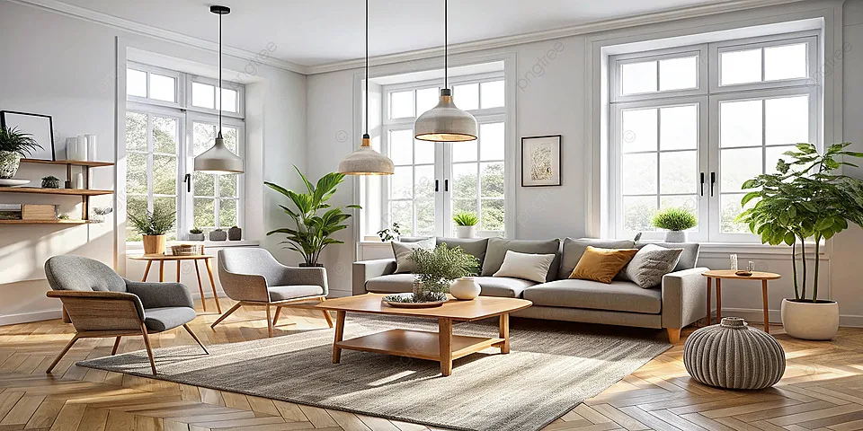
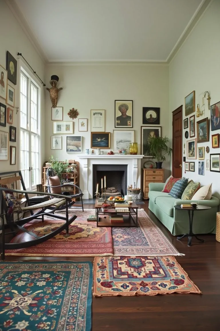
Image source: Bing (Web (fair-use with source credit))
Your perception of size is an optical illusion based on how light bounces off surfaces. When a surface reflects more light, the boundary between walls and corners becomes less distinct. This blur helps the human eye interpret the space as continuous and expansive.
Dark colors absorb light. This makes the boundaries of a room feel firm and clearly defined, which inherently shrinks the perceived volume. Light colors force the eye to move across the space without catching on sharp, high-contrast edges.
You should aim to minimize high-contrast transitions. When your baseboards, door frames, and walls share similar tones, the eye ignores the room's skeleton. This creates a sense of seamlessness that is crucial for small-room design.
How Light Reflectance Value (LRV) Trumps Trend
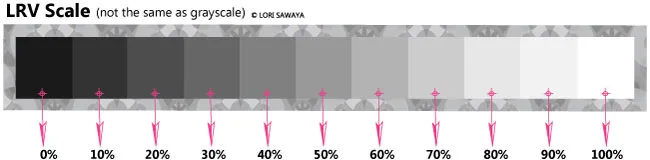
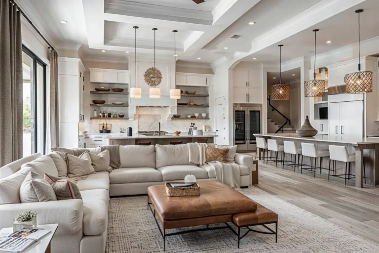
Image source: Web (Bing) / thelandofcolor.com (Web image (fair-use with source credit))
Every paint color has a specific Light Reflectance Value, or LRV, which measures the percentage of light a color reflects. On a scale from 0 to 100, zero is absolute black and 100 is pure white. High LRV colors are your best allies for expanding a room.
Per ASTM International standards, this value is a critical technical metric for architects and designers. A color with an LRV of 70 reflects 70 percent of the light that hits it. Choosing paint with an LRV above 60 ensures your walls act like mirrors rather than sponges.
| Color Type | Typical LRV Range | Impact on Space |
|---|---|---|
| Bright White | 80–90 | Maximum expansion |
| Soft Off-White | 70–80 | Airy and balanced |
| Light Greige | 60–70 | Subtle depth |
| Mid-Tone Gray | 40–50 | Intimate feel |
Don't ignore the finish of the paint. A satin or eggshell finish increases light reflection compared to a flat, matte finish. This slight sheen bounces light into the corners of the room, effectively reducing shadows that often signal smallness to the brain.
The Receding Effect: Cool Tones vs. Warm Tones
Colors are categorized by their temperature, and this significantly alters spatial perception. Cool colors, such as light blues, greens, and soft grays, are known as receding colors. They naturally pull away from the viewer’s eye, making walls feel further away than they actually are.
Warm colors like yellows, creams, and beiges are advancing colors. They move toward the viewer, which can make a small room feel cozy but rarely spacious. If you want to maximize square footage, lean toward cool, light-toned neutrals.
If you love warm tones, you don't have to give them up. Opt for a warm white with a high LRV that mimics natural daylight. This gives you the comfort of a warm hue without the closing-in effect associated with darker, saturated pigments.
Research into human spatial cognition suggests that the brain interprets cool, bright environments as larger. You are essentially hacking your own visual processing system by choosing light, cool-leaning pigments. This shift is subtle but highly effective for tight corridors or small bedrooms.
Mastering the Monochromatic Flow: Walls, Trim, and Ceilings
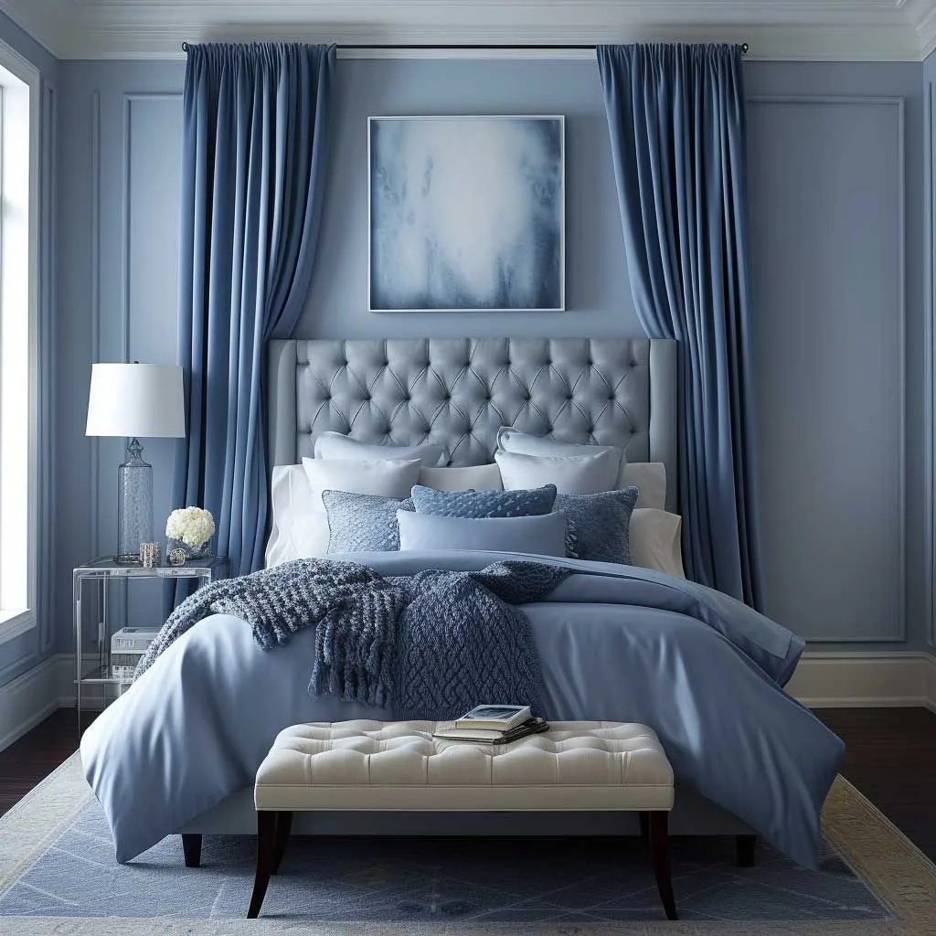
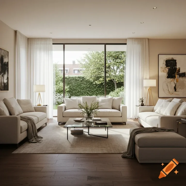
Image source: Web (Bing) / pinterest.com (Web image (fair-use with source credit))
The biggest mistake in small rooms is chopping them into segments. When you paint walls one color and trim another, you create a geometric frame. This frame tells your brain exactly where the wall ends and the ceiling begins.
Paint your walls, baseboards, and door trim the same color to make the room vanish. This removes visual barriers. By creating a monochromatic envelope, you force the eye to travel across the entire surface without stopping at borders.
Painting the ceiling a shade lighter than the walls is a classic trick, but painting it the exact same color is even better for height. It erases the horizon line where the wall meets the ceiling. This vertical continuity pulls the gaze upward, making the ceiling appear higher.
Treat your molding and crown architecture as part of the wall surface. If you want a slight bit of texture, change the sheen rather than the color. Use a matte finish on the walls and a satin or semi-gloss on the trim.
Room Directionality: Adapting Your Palette to Natural Light
The natural light in your room dictates how a color behaves. A bright white paint can look stark and cold in a room that faces north because it lacks direct sunlight. It needs a warmer undertone to keep the space feeling soft.
South-facing rooms get plenty of warm, golden light throughout the day. These rooms can handle cooler colors easily. A crisp, cool blue or light gray will feel fresh and expansive in these spaces.
- North-facing rooms: Use creamy off-whites or warm greiges. Avoid gray-blues as they will look murky.
- South-facing rooms: Use cool whites, light blues, or soft greens. The natural light will balance the coolness perfectly.
- East/West-facing rooms: Check your colors at different times of the day. These rooms change drastically from sunrise to sunset.
Always test your color in the actual room. Paint a large sample board rather than a small square on the wall. Move the board between different walls to see how the light changes throughout the day.
Common Pitfalls That Shrink Your Space
The most frequent mistake is choosing a color based on a tiny swatch rather than the room's actual light conditions. A sample that looks bright in a hardware store can turn gray or muddy once it covers four walls. Always test your paint in the actual space under different lighting times.
Another common error is using high-contrast colors for trim and ceiling work. Bright white trim against a pastel wall creates a distinct outline that draws your eye to every corner. This effectively maps out the perimeter of the room, emphasizing its small footprint instead of masking it.
Avoid overly saturated, dark colors if you are working with limited square footage. These shades absorb almost all ambient light, turning the room into a deep shadow box. While moody design is popular, it creates a sense of confinement that is the exact opposite of what you want.
Lastly, don't ignore the floor color. If your walls are light and airy but your flooring is a heavy, dark wood or deep carpet, the room will feel bottom-heavy. Aim for a unified color palette from floor to ceiling to create a cohesive, expansive atmosphere.
Expert Advice on Testing and Execution
Before you commit to a color, buy a sample quart and paint a large foam core board. Place this board on different walls throughout the day. You'll quickly see how the color shifts from morning sunlight to evening artificial light.
If you are painting over a dark color, use a high-quality primer to ensure the new, lighter shade sits correctly. A poor base coat will cause the underlying color to bleed through, resulting in a dull, muted finish. Proper preparation is the foundation for a professional, light-reflecting result.
Consider the role of furniture and wall art in your overall spatial plan. If your walls are a light, expansive neutral, keep your furniture profiles low and slender. A massive, dark-colored sofa can negate the positive effects of your wall paint by visually crowding the room.
If you're unsure about undertones, consult a fan deck from a professional paint supplier. Look for colors with neutral or cool bases rather than strong yellow or pink undertones. These can shift unpredictably in small rooms, creating an unwanted tint that changes the perceived temperature of the space.
Frequently Asked Questions
Does painting the ceiling white always help?
Not necessarily. While white is a classic choice, it can create a hard line where the wall meets the ceiling if the wall color is very different. Painting the ceiling the same color as the walls creates a seamless, infinite feel that can make a room look much larger.
Are glossy finishes better than flat ones for small rooms?
Glossier finishes like satin or semi-gloss reflect more light, which helps brighten a space. However, they also highlight every imperfection in the drywall. Use an eggshell finish for a perfect middle ground that provides a subtle glow without exposing every bump or crack.
How do I handle small, windowless rooms?
Windowless rooms rely entirely on artificial light. Stick to high-LRV warm whites to prevent the room from feeling cold and clinical. Use floor lamps or wall sconces to bounce light off the ceiling, which helps distribute brightness more evenly and softens the lack of natural windows.
What about accent walls in a small room?
Accent walls often break the flow of a small room. Instead of creating a focal point, they usually act as a visual stop sign. If you want to add character, use subtle textures or shades that are only slightly darker than your main wall color for a smoother look.
Can mirrors replace the need for lighter paint?
Mirrors are powerful, but they work best when paired with light paint. A mirror in a dark room just reflects the darkness, which doesn't do much for perceived size. Use a large mirror on the longest wall to double the visual depth of the space in combination with a bright, reflective wall color.