How to Choose a Color Scheme for a Room
Learning how to choose a color scheme for a room starts with understanding that paint is more than just a pigment on the wall. It is a reaction to your specific light, furniture, and personal habits.
As of 2026, interior design standards suggest focusing on fixed elements like flooring and textiles before selecting a wall color. This prevents costly repainting projects when colors clash under real-world lighting conditions.

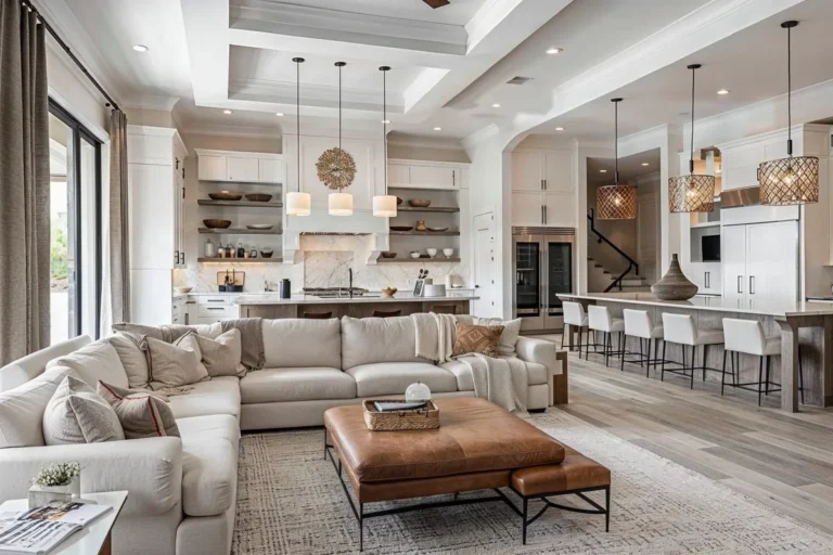
Image source: Bing (Web (fair-use with source credit))
Quick Answer
Choose a color scheme by identifying your room’s primary fixed element first. Apply the 60-30-10 rule for a balanced and professional look. Always test paint samples in your specific room light.
Avoid clashing undertones between walls and large furniture. Pick colors that match your desired mood.
Why Your Paint Looks Different at Home: The Role of Light and Undertones
Paint colors behave differently based on the light source, a phenomenon known as metamerism. Research from the Illuminating Engineering Society confirms that the color rendering index of your light bulbs changes how the human eye perceives pigment. A blue-grey might look perfectly neutral in a store but turn icy and cold under your home’s warm LED lighting.
Every paint color also contains an undertone. This is a subtle hint of another color hidden within the main shade. You might see a neutral white that actually has a pink or yellow base.
If your floor has a strong orange-oak grain, a paint with a purple undertone will often clash, making the walls look dirty or off-balance.
Always observe your paint samples at different times of the day. Morning light is often blue and cool, while late afternoon sun adds golden warmth. If a color doesn't look right during the brightest part of the day, it likely won't work in the space.
The 60-30-10 Rule: Establishing Your Visual Hierarchy
The 60-30-10 rule provides a simple workflow to create professional-looking balance without needing a design degree. You assign your colors based on a specific ratio to ensure one shade doesn't overwhelm the space.
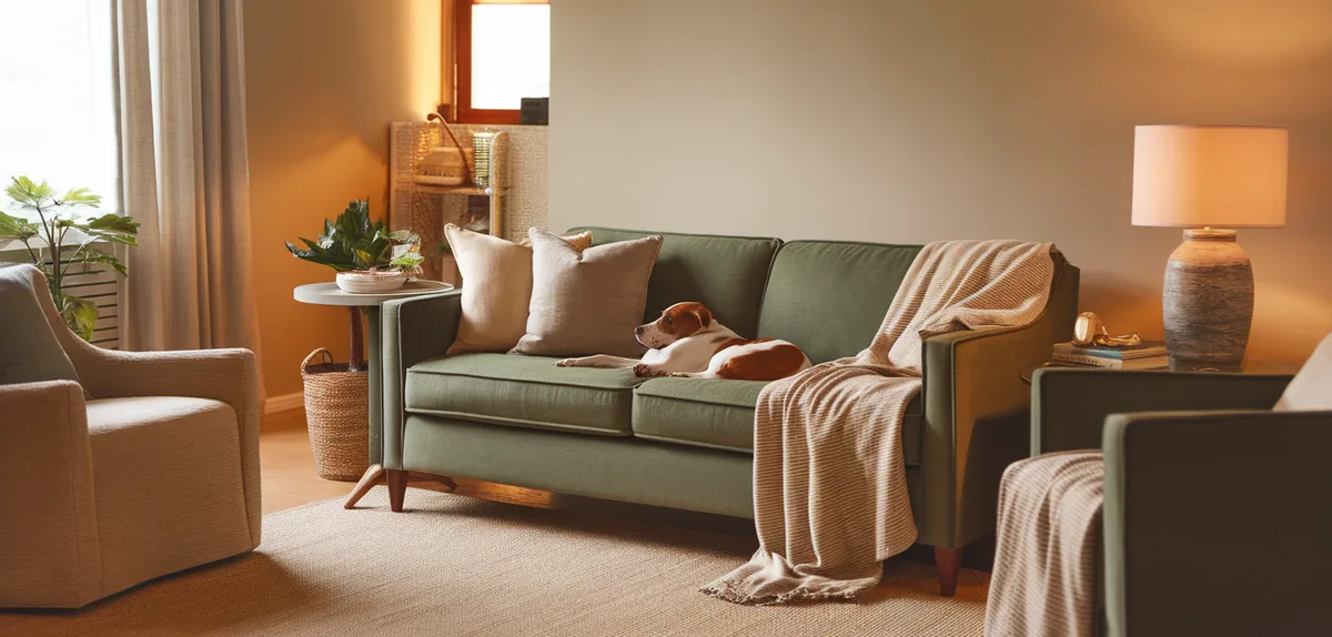
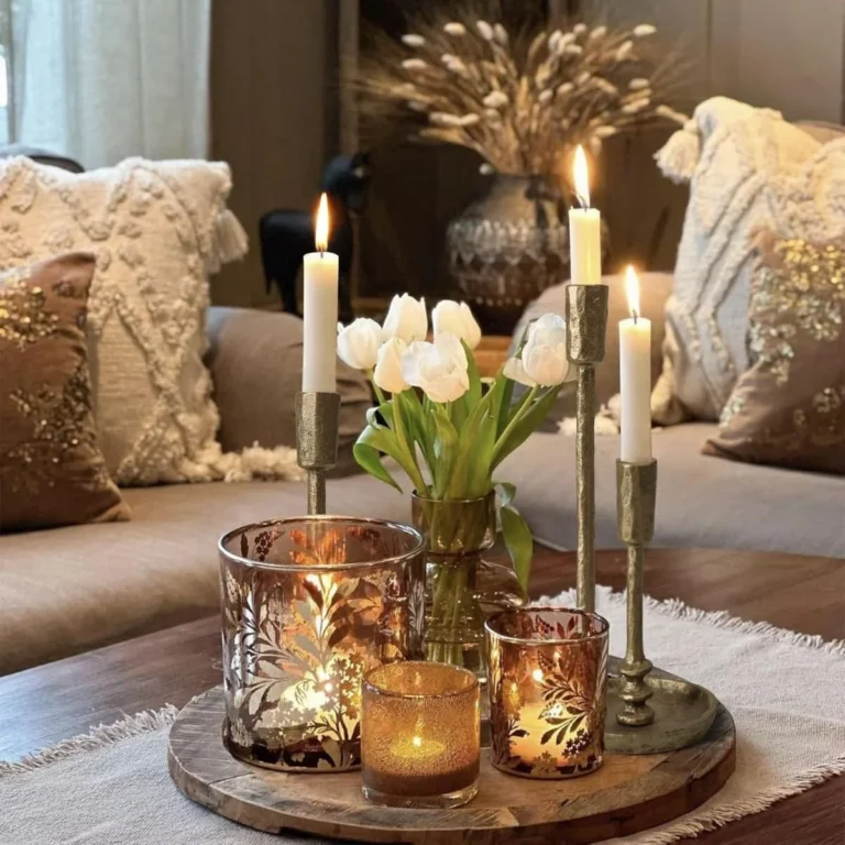
Image source: Bing (Web (fair-use with source credit))
- 60% (Primary): This is your dominant color. It usually covers the walls, the largest area rug, and potentially your window treatments. It creates the canvas for the room.
- 30% (Secondary): Use this for furniture, accent chairs, or bedding. It should provide enough contrast to keep the room from feeling flat, but it shouldn't be as bold as your accent pieces.
- 10% (Accent): This is your pop of color. Use this for throw pillows, small vases, artwork, or lamp bases. It’s the easiest element to swap out if you decide to refresh your look later.
When you stick to this ratio, the room feels intentional. If you have a neutral wall, your furniture acts as the secondary color, and your art provides the final 10% of interest. This hierarchy keeps the eye moving naturally across the space.
How Room Orientation Changes Your Color Selection
The direction your windows face dictates the temperature of your natural light. A room facing north receives consistent but cool, blue-tinted light throughout the day. In these rooms, avoid cool-toned whites or grey paints, as they will highlight the lack of warmth and make the space feel sterile.
South-facing rooms receive the most intense, warm light. You can pull off almost any color here, including darker or bolder shades. However, be mindful that bright white walls in a south-facing room can cause excessive glare during the middle of the day.
| Orientation | Light Quality | Best Color Strategy |
|---|---|---|
| North | Cool/Blue | Use warm, creamy, or saturated tones |
| South | Warm/Bright | Works with cool, neutral, or dark tones |
| East | Morning Sun | Soft, light shades feel fresh; avoid dark colors |
| West | Evening Sun | Balanced, but avoid colors with too much red |
If you are unsure of your orientation, use a basic compass app to track your light. If you’re living in a space with very little natural window light, aim for mid-tone colors. Extremely dark colors in windowless rooms often require significant artificial lighting to avoid feeling like a cave.
Identifying Undertones and Preventing Clashing
Identifying undertones is the single most important skill for avoiding a room that just "feels off." An undertone is the secondary color hidden in a neutral, like the green in a tan paint or the blue in a grey one. To identify them, place your paint sample next to a piece of pure white printer paper.
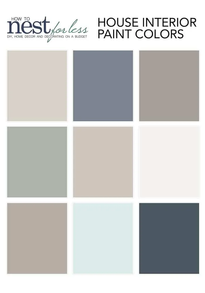
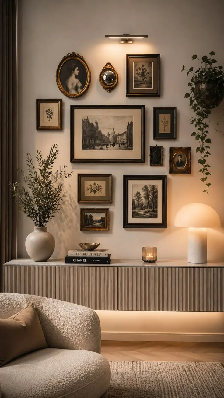
Image source: Bing (Web (fair-use with source credit))
The white paper provides a baseline. You will immediately notice if your "grey" is actually leaning toward blue, green, or purple. If you ignore this step, you risk pairing a "cool" wall color with "warm" wood trim, which often makes the wood look orange and the wall look sickly.
Use these simple strategies to confirm you've found the right match:
- The Comparison Test: Place your paint sample directly against your couch or existing curtains. If one looks muddy or jarring, they have competing undertones.
- The Bridge Method: If you have two colors that don't quite mesh, find a pattern in a throw pillow that includes both shades. This helps the human eye interpret the pairing as intentional.
- The Neutral Check: If you are unsure about a color, pair it with a known warm or cool neutral. If the neutral looks better than the paint, start over.
Building Your Palette: A Step-by-Step Selection Workflow
Start by picking an "anchor" piece. This is a large item in your room that you love and intend to keep. It could be an area rug, a patterned armchair, or a piece of wall art.
Everything else in your palette should draw from the colors present in that anchor piece.
Once you have your anchor, follow this flow to finalize your palette:
- Extract the Base: Identify the most neutral color in your anchor piece to use as your 60% color.
- Define the Secondary: Choose the most prominent non-neutral color in the anchor for your 30% allocation.
- Choose an Accent: Pick the smallest, most vibrant color in the pattern for your 10% accents.
- Create Large Samples: Do not rely on tiny paint chips. Buy sample pots and paint them onto large poster boards.
- Test the Transition: Move these boards into different corners of the room. Observe them at 9:00 AM, 1:00 PM, and 8:00 PM under both natural and artificial light.
If a color looks different at 8:00 PM than it does at noon, it’s not necessarily a bad color. You just need to ensure you enjoy it in both scenarios. If it looks wrong in the evening when you spend the most time in the room, discard it.
Visual Mistakes That Break a Room’s Cohesion
The most common visual mistake involves ignoring the flow between adjacent spaces in an open-concept layout. When you paint each room an entirely different, high-contrast color, you create a choppy environment that feels smaller than it actually is. Try to maintain a common neutral tone across hallways and transitions to unify the floor plan.
Another frequent error is failing to consider the sheen of your paint. A high-gloss paint in a living area will highlight every imperfection in your drywall, creating distracting shadows or reflections. If you want a durable, soft finish, eggshell or matte finishes are usually the better choice for main walls.
Lastly, don’t ignore the vertical space. Many people focus only on the walls and ignore the ceiling, which is often painted a bright, stark white. If your wall color is very dark or bold, a standard bright white ceiling can create a harsh, jarring contrast.
Consider a ceiling shade that is two or three tones lighter than your wall color to create a softer, more sophisticated transition.
Frequently Asked Questions
How do I pick a color for a small, dark room?
Choose lighter, reflective colors that have cool undertones. This helps the room feel more expansive and open. Avoid deep, saturated colors that absorb light, as they will make the space feel smaller.
Pair these lighter walls with mirrors to bounce natural light around the room.
Should I paint the trim the same color as the walls?
Painting the trim the same color as the walls creates a modern, seamless look that can make ceilings appear higher. If you prefer a traditional aesthetic, stick to a semi-gloss white or cream for the trim. This contrast adds definition to the architecture of the room.
Can I mix metal finishes in my color scheme?
You can mix metals, but keep one finish as the dominant choice. For example, use brushed nickel for the majority of hardware and incorporate brass or matte black as an accent. This creates a balanced, curated feel rather than a messy, accidental aesthetic.
How do I fix a room that feels too cold or sterile?
Introduce warmer textures like wood, wool, or linen to balance the temperature. Add rugs, throw blankets, or natural woven baskets. These elements soften the space and provide the necessary visual warmth that a simple paint color might be missing.
Is it necessary to prime before changing wall colors?
Priming is essential if you are making a drastic color change, such as going from a very dark shade to a light one. A high-quality primer ensures true color representation and better adhesion. Skipping this step often requires extra coats of expensive paint to achieve full coverage.