How to Choose Wall Decor Colors
Choosing the right wall decor colors effectively transforms your living space from a collection of items into a cohesive home. Learning how to choose wall decor colors requires you to balance your personal style with the specific lighting and architectural constraints of your room.
You should anchor your color scheme to a primary focal point, such as a large piece of art or a patterned rug. This approach ensures your decor feels intentional rather than accidental, according to standard interior design principles used as of 2026.
Quick Answer
Choose wall colors by matching your room’s primary focal point. Analyze the natural light orientation to predict shade shifts. Select neutrals for busy art or bold colors for minimal decor.
Test large samples against your furniture before buying full paint cans. Stick to a 60-30-10 ratio for color balance.
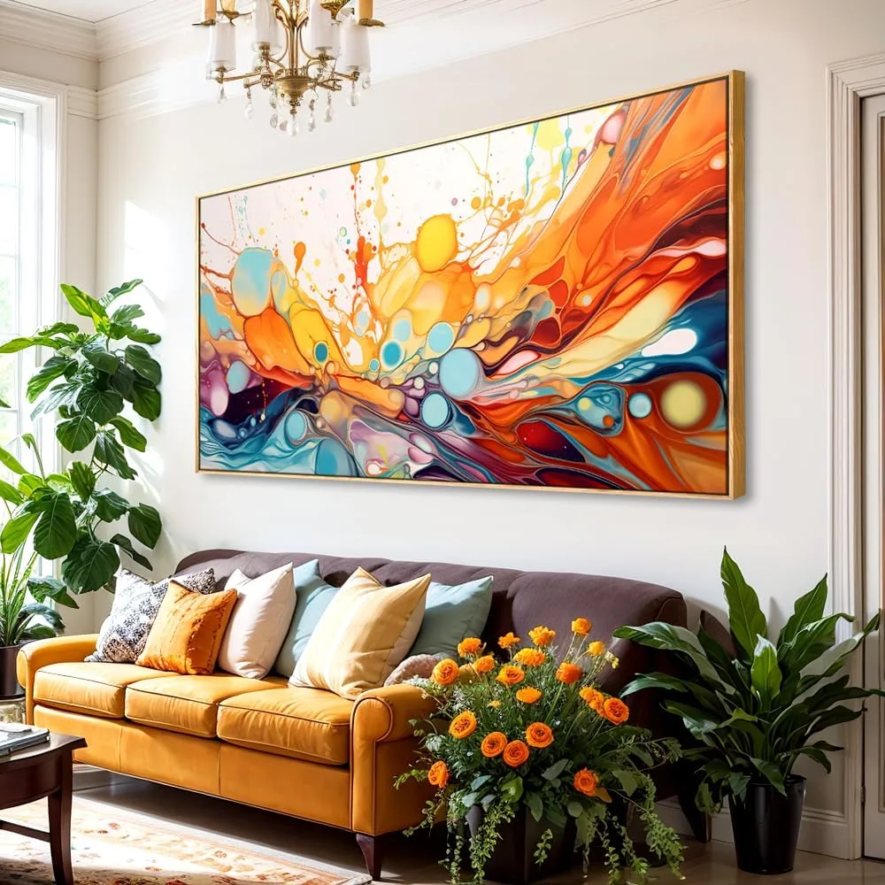
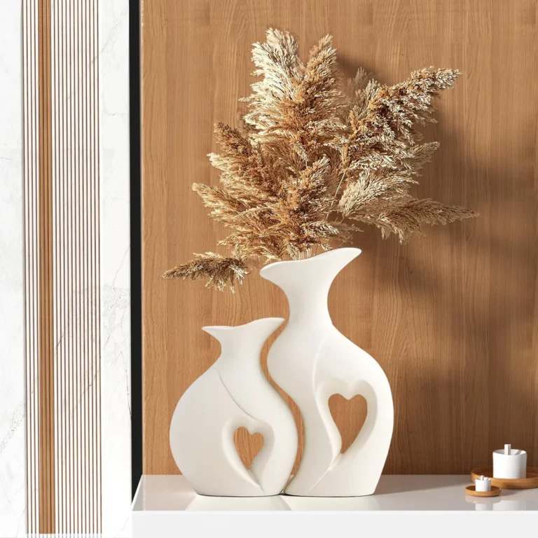
Image source: Web (Bing) / amazon.ca (Web image (fair-use with source credit))
Why Your Wall Color Changes Everything (Except the Art)
Your wall color acts as the frame for everything else in the room. A mismatched wall can make expensive art look cheap or leave a well-designed space feeling flat and uninviting. The secret is viewing the wall as a supporting player that either highlights your decor or provides necessary breathing room.
Research into environmental psychology shows that wall hue significantly influences perceived spatial volume. Light colors typically expand a room while dark, saturated tones create a cozy, intimate atmosphere. If you have ever painted a room and felt like the furniture suddenly looked wrong, you likely hit a clash between the wall's undertone and your decor.
Finding Your Anchor: How to Start with Your Decor
Identify your anchor piece before picking a single paint swatch. This is the item in your room that you love most or that sets the tone for the entire space. It could be a vibrant canvas, a patterned area rug, or even a set of patterned throw pillows.
- The Contrast Method: If your anchor piece is busy, loud, or highly detailed, choose a neutral wall color. This lets the eye rest and prevents the room from feeling chaotic.
- The Harmony Method: If your decor is simple or monochromatic, you can safely use a deeper or more vibrant wall color to make those pieces stand out.
The goal is to avoid competing interests. If both the wall and the decor scream for attention, the room loses its visual balance. You can verify your choices against the American Society of Interior Designers guidelines for professional-grade design harmony.
Mastering Light and Orientation: The Invisible Factors
Light behaves differently depending on which way your windows face, which directly impacts how colors read on your wall. A cool gray might look sophisticated in one room but like a cold hospital wing in another.
| Window Direction | Light Quality | Decor Strategy |
|---|---|---|
| North | Consistent but cool/bluish | Use warm whites or earthy tones. |
| South | Warm, bright, and intense | Use cool blues or crisp, clean grays. |
| East | Bright morning, dim afternoon | Keep walls light; avoid deep saturation. |
| West | Dim morning, warm afternoon | Use cool-toned neutrals for balance. |
Always account for the time of day you use the room most. A home office used during the morning needs a different wall color than a living room used primarily for evening relaxation.
Decoding Color Theory Without the Technical Jargon
Color theory sounds intimidating, but it really just boils down to how colors sit next to each other on a wheel. You do not need a fine arts degree to grasp the basics of harmony.
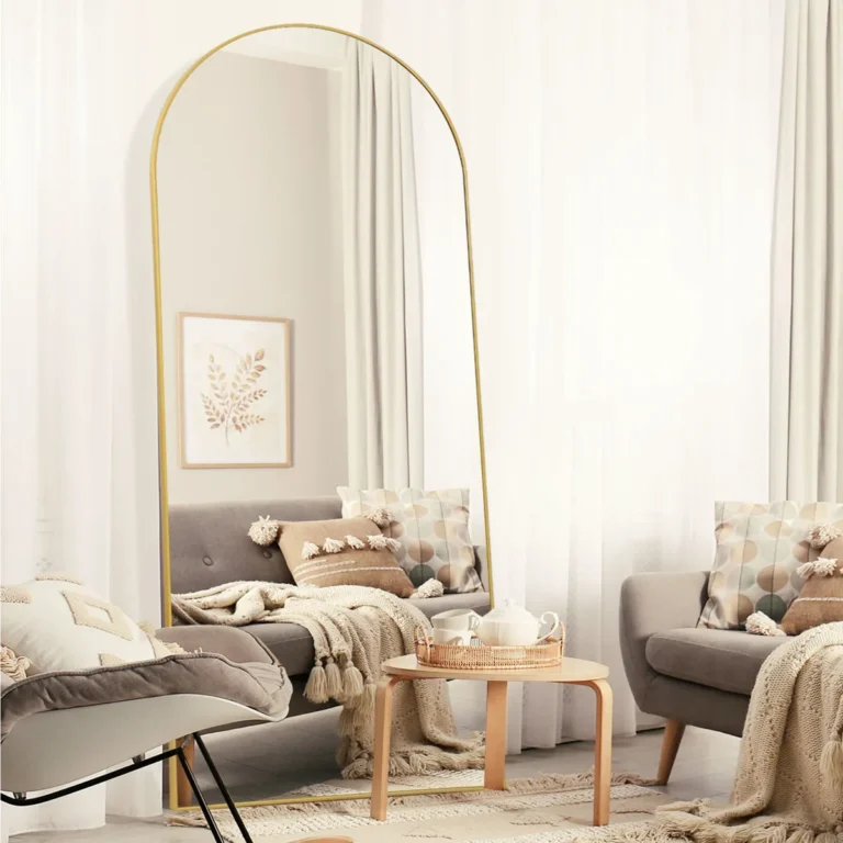
Image source: Web (Bing) / in.pinterest.com (Web image (fair-use with source credit))
Think of color temperature as the main filter for your room's personality. Warm colors like reds, oranges, and yellows add energy and intimacy. Cool colors like blues, greens, and violets create a sense of calm and openness.
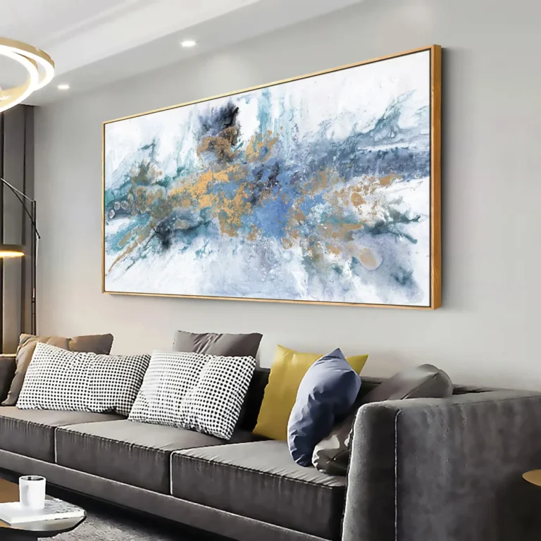
Try to pick a wall color that pulls an undertone from your art. If your painting has hints of golden yellow, a soft cream or warm white wall will make those yellows pop. If the art features deep blues, a cool-toned gray wall will make the art feel like a natural extension of the room.
Step-by-Step: The Sampling Process That Saves Time
Never commit to a gallon of paint based on a tiny paper chip from a store. You must see how the color interacts with your actual light and your specific decor items. Follow this workflow to ensure you get it right the first time.
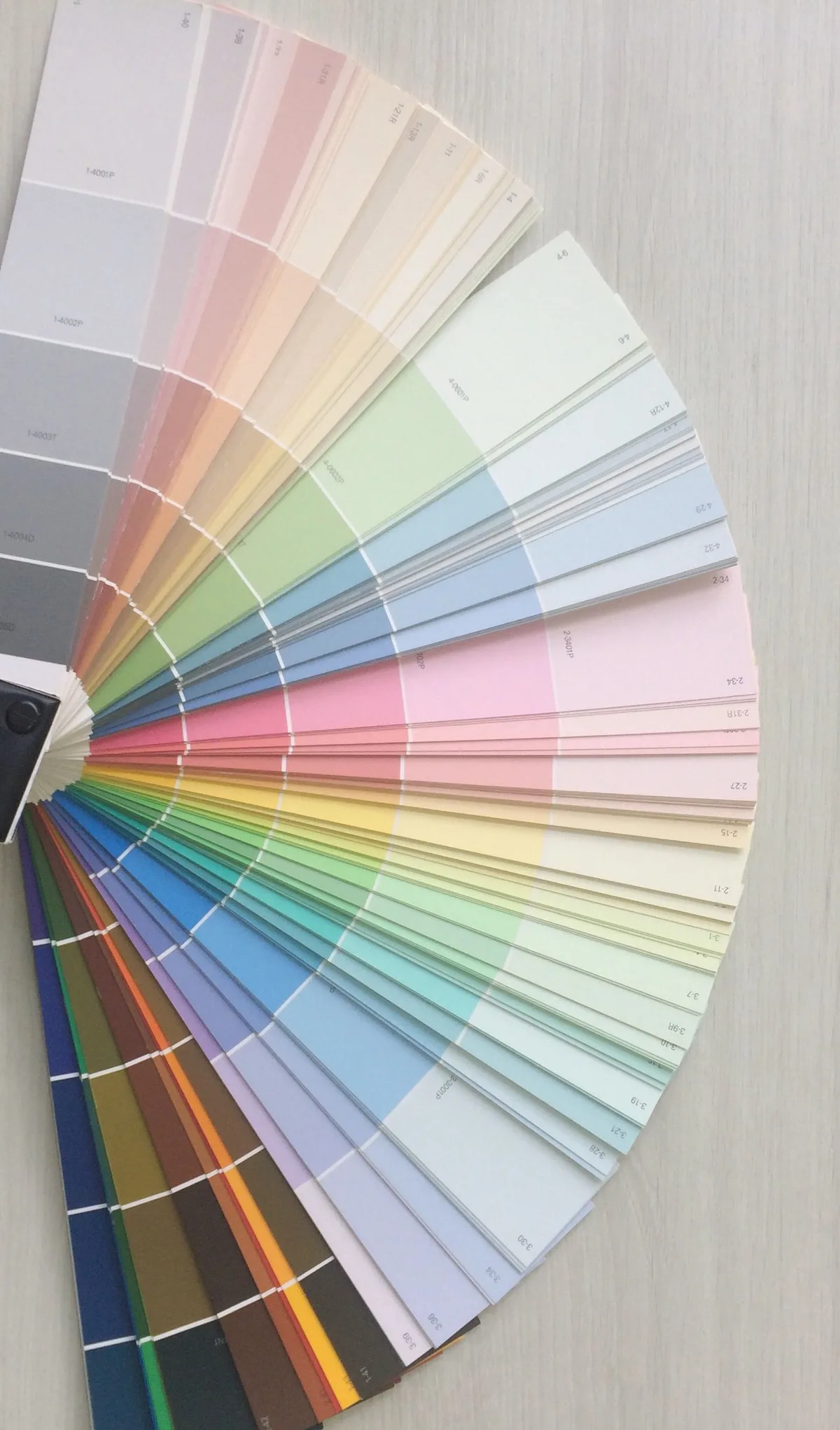
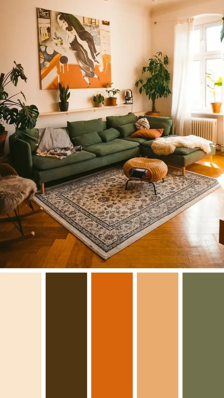
Image source: Web (Bing) / pinterest.com (Web image (fair-use with source credit))
- Buy Large Samples: Purchase peel-and-stick samples or small pots of paint to test.
- Paint Poster Boards: Cover at least 2-foot by 2-foot squares of white poster board.
- Test in Corners: Move the boards around. Check them in the darkest corner and the brightest window-adjacent spot.
- Observe for 24 Hours: Look at the samples at 8:00 AM, 1:00 PM, and 8:00 PM to see how the shifting sun changes the color.
- Placement Check: Hold the board directly behind your anchor decor to see if the colors fight or complement each other.
This process removes the guesswork. If a color looks off in the morning light, it will likely annoy you every morning for years. It is much cheaper to throw away a poster board than it is to repaint an entire room.
Avoiding the Muddy Look: Common Decorating Mistakes
Avoid the muddy look by paying close attention to the Light Reflectance Value (LRV) of your chosen paint. LRV measures how much light a color reflects, ranging from 0 (pure black) to 100 (pure white). Using a color with an LRV too low for your room's natural light level is the leading cause of walls looking flat, dingy, or muddy.
Another frequent error is ignoring the finish of your paint. A flat or matte finish hides wall imperfections but absorbs light, which can make colors appear deeper and sometimes darker than intended. Conversely, high-gloss finishes reflect significant light but highlight every bump, scratch, or repair on your drywall.
- Color Bleed: Placing a vibrant object near a neutral wall can cast a faint reflection of the object's color onto the wall itself.
- The Undertone Clash: Many white paints are not pure. Some lean green, pink, or yellow. Test these against your art to ensure the wall does not turn your neutral background into an accidental accent color.
- Over-Saturation: If you choose a bold, saturated color, remember that it will coat all four walls. This intensity is often too much for small spaces and can make the room feel cramped or claustrophobic.
If you struggle to balance these factors, look toward greige or soft taupe tones. These hybrids are specifically formulated to sit between gray and beige, which helps them adapt to various lighting conditions without skewing too cool or too warm.
Frequently Asked Questions About Wall Colors and Decor
Can I paint my walls the same color as my art?
Yes, but you must vary the finish or the saturation. Painting the wall a slightly lighter or darker version of your art's dominant color creates a seamless, sophisticated look. If the wall and art are the exact same shade and finish, the art will disappear.
Use a matte finish for the wall and a satin finish for any molding to create subtle visual depth.
How do I highlight art on a dark wall?
Dark walls provide a dramatic background for art, but they require adequate lighting to succeed. Use dedicated picture lights or adjustable track lighting to direct a beam specifically onto the artwork. This contrast ensures the piece remains the focal point rather than fading into the background.
Choose art with lighter frames or high-contrast imagery for the best result.
What is the 60-30-10 rule?
This standard design proportion helps you distribute color effectively throughout a room. You designate 60 percent of the room to a primary color, which is usually your wall paint. The next 30 percent goes to a secondary color, often your furniture or large rug.
The final 10 percent is reserved for bold accent colors found in your art or decorative accessories.
Should my ceiling match my wall color?
Painting your ceiling a lighter shade of your wall color is the safest way to maintain a clean aesthetic. You can also use a crisp, bright white to make the ceiling appear higher. Avoid painting the ceiling a darker color than your walls unless you want to intentionally lower the visual height of the room for a cozy, cocoon-like effect.