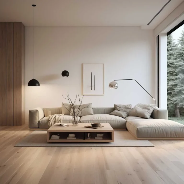
How to Choose Colors for Home Decor
Choosing the right paint for your space is a task that often feels more daunting than it needs to be. Learning how to choose colors for home decor effectively requires moving away from pure intuition and focusing on the physical variables of your specific environment.
Our research indicates that light exposure and existing fixed elements serve as the primary drivers of color success. As of 2026, industry standards from the Illuminating Engineering Society suggest that the color rendering index of your lighting source plays a critical role in how those colors are perceived.
Quick Answer
Select wall colors based on existing floor and furniture tones first. Test multiple paint samples in different room lighting conditions. Use the 60-30-10 ratio to balance your overall palette.
Avoid harsh lighting that distorts your chosen paint shades. Verify final choices across morning and evening light cycles.
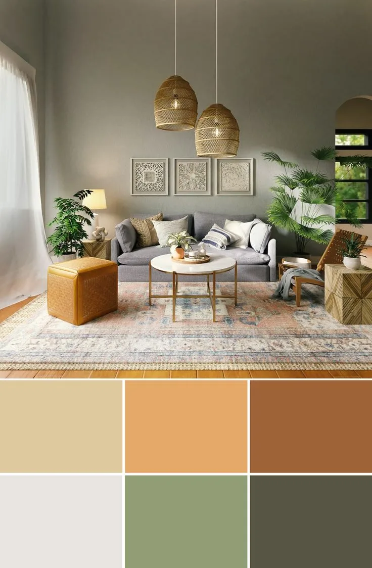
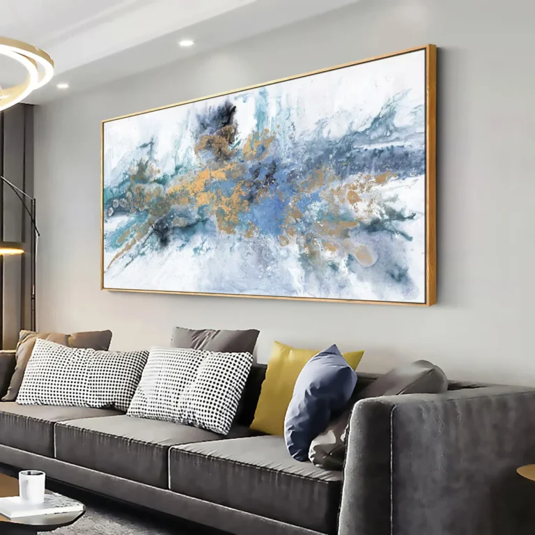
Image source: Web (Bing) / pinterest.com (Web image (fair-use with source credit))
The Unchangeables Audit: Assessing Your Current Space
Before you look at paint chips, you must audit the permanent features of your room. These elements, often called the unchangeables, dictate which colors will work and which will clash. You cannot easily replace your flooring or cabinetry, so your paint must complement them.
Check the undertones in your flooring first. Hardwood with strong orange or red tones often fights with cool-toned grey walls. If your floor is a neutral oak or dark walnut, you have more flexibility.
Assess your fixed fixtures like tile, stone fireplaces, and built-in shelving units.
Identify the dominant color in your existing furniture. If your sofa is a deep navy or a vibrant velvet, that piece will exert a visual pull on the walls. Note whether your home uses brushed nickel, brass, or oil-rubbed bronze hardware.
These metal finishes interact with wall colors and can make certain paint tones look dated or fresh.
Decoding Light: How Direction and CRI Affect Your Color
Light is the most influential variable in how a paint color appears on your wall. Natural light shifts throughout the day, altering the hue and saturation of your paint. A color that looks soft and airy at noon may turn muddy or grey once the sun begins to set.
North-facing rooms receive consistent, cool light that often makes colors look darker or bluer. South-facing rooms benefit from intense, warm sunlight that can wash out pale colors while making bright ones pop. East-facing rooms are best in the morning, while west-facing rooms gather deep, warm golden light in the late afternoon.
The Color Rendering Index, or CRI, measures how accurately light sources display true color. Low-quality LED bulbs often have a poor CRI, which makes walls look dull or yellowish regardless of the paint chosen. Upgrade your light bulbs to high-CRI options if you want your wall colors to appear vibrant and accurate throughout the night.
The 60-30-10 Workflow: Designing Your Color Palette
The 60-30-10 rule provides a balanced framework for distributing color throughout a room. This simple ratio prevents visual chaos and ensures your space feels intentional. It keeps your primary color from overwhelming the senses while giving accent colors enough room to shine.
| Element Type | Percentage | Typical Usage |
|---|---|---|
| Primary | 60% | Walls, large area rugs |
| Secondary | 30% | Upholstery, curtains, chairs |
| Accent | 10% | Pillows, art, decor items |
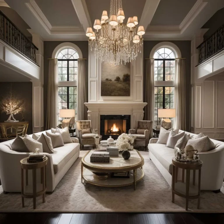
Image source: Bing (Web (fair-use with source credit))
Start with your 60% neutral. This is usually the color you apply to the walls. Select a secondary 30% color for your larger furniture pieces or window treatments to create depth.
Use the final 10% for high-contrast accents like throw pillows or statement artwork to draw the eye.
The Professional Testing Process: Avoiding Metamerism
Metamerism occurs when colors look identical under one light source but change significantly when the light shifts. This is why you should never commit to a color based solely on a small store swatch. The paper chip lacks the texture and scale of a real wall.
Purchase large, peel-and-stick samples or sample pots. Apply them to different walls within the same room. You must observe how the color behaves on a wall with a window versus a wall in the deep shadow.
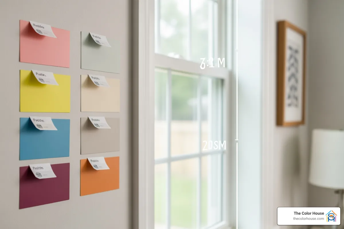
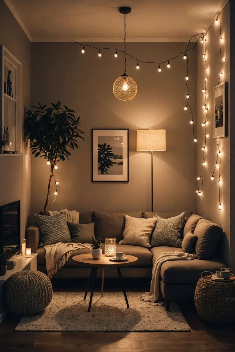
Image source: Bing (Web (fair-use with source credit))
Keep your samples up for at least 24 hours. Look at the colors during the early morning, the peak of the afternoon, and after you switch on your lamps at night. If you notice a color flashing an unwanted undertone, such as a green tint in a neutral beige, discard that option immediately.
Common Color Mistakes and How to Catch Them Early
One of the most common errors is failing to match paint undertones with existing trim. If your baseboards are a creamy yellow-white, a crisp, blue-toned white on the walls will make the trim look dirty. Always align your wall paint's undertone with the trim's undertone.
Another mistake is neglecting to account for the total surface area. A color that looks perfect on a 2-inch square chip often gains intensity when it covers four large walls. If you are nervous about a bold color, go one shade lighter on the strip to avoid an overwhelming result.
Avoid the temptation to paint your trim in a drastically different color before testing it against the wall. Contrast is good, but clashing undertones are visible even to the untrained eye. When in doubt, lean toward muted or "dirty" colors, as these shades contain enough grey to be naturally forgiving in almost any light.
Troubleshooting Undertones and Trim Conflicts
Undertones are the subtle secondary colors hidden within a paint chip that only reveal themselves once the paint is applied to a large surface. You might pick a grey that looks neutral on the swatch but turns distinctly blue or purple on your wall. This often happens because the wall reflects light differently than the paper sample.
To spot these hidden tones, hold your paint sample against a sheet of pure white printer paper. The contrast makes the true base color, whether it leans green, pink, or yellow, much easier to identify. If your trim is already painted, compare the sample directly to the wood frame to ensure they don't clash.
If you have off-white trim with yellow undertones, avoid cool whites or greys on your walls, as they will make the trim look aged or stained. Instead, stick to warmer neutrals that share the same color family. When in doubt, perform your testing during different times of the day to see if that sneaky undertone becomes more prominent in shadows or direct light.
Frequently Asked Questions About Home Color Choice
How can I make a small room feel larger with color?
Light, cool-toned colors like soft blues, greens, and crisp whites reflect more natural light and help blur the boundaries of a small room. Using the same color for your walls, trim, and ceiling creates a seamless, uninterrupted surface that tricks the eye. Avoid high-contrast trim, as it acts like a frame and highlights the limited dimensions of the space.
Should I paint the ceiling the same color as the walls?
Painting the ceiling a lighter shade of your wall color is a reliable way to make a room feel taller. If you want a cozy or dramatic effect, you can paint the ceiling the same color as the walls to remove sharp lines. Always remember that ceiling paint is usually flat, which prevents glare and hides minor imperfections on the surface.
What is the best way to choose a color for a room with no windows?
Choose colors that have a warm, inviting quality to compensate for the lack of natural light. Mid-toned colors often perform better than stark whites, which can look flat and lifeless in artificial light. Use high-CRI light bulbs to ensure your chosen color doesn't shift into a muddy or greenish tone.
How often should I test a paint sample?
Apply your sample to a board or a section of the wall and view it across a full 24-hour cycle. You need to see how it looks in morning light, afternoon sunlight, and the artificial glow of your evening lamps. If the color maintains its character throughout all three conditions, it is likely a safe choice for your home.