How to Mix Different Wall Art Styles
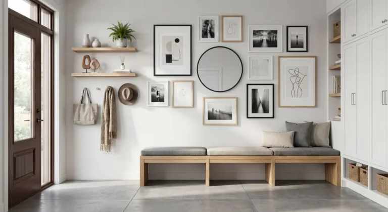
Learning how to mix different wall art styles is the most effective way to turn a generic room into a curated space. You do not need to choose a single theme or aesthetic to make your walls look cohesive. By focusing on shared elements like color, frame finish, or subject matter, you can blend diverse pieces into one intentional display.
When planning your layout, aim to keep your primary display center at 57 inches from the floor, which is the industry standard for optimal viewing height. This consistent elevation creates a sense of order, even when your art styles differ wildly. As of 2026, many professional designers use this measurement to maintain balance in residential gallery walls.
Quick Answer
You can mix different wall art styles by identifying a common thread. Match pieces using a shared color palette or frame finish. Vary the frame sizes to keep the display dynamic.
Distribute dark or heavy pieces across the wall to balance weight. Keep consistent gaps between frames for a clean look.
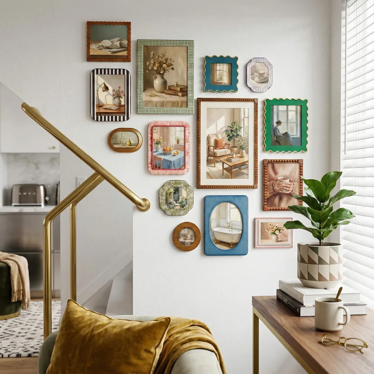
Image source: Bing (Web (fair-use with source credit))
Why "Anything Goes" Leads to Wall Clutter
Mixing art styles often fails when you treat the wall like a random collection bucket. You might love a vintage oil painting and a bright, geometric print, but hanging them together without a plan causes visual chaos. The human brain naturally seeks patterns in the chaos of a wall display.
When those patterns are missing, the wall feels messy rather than eclectic.
Avoiding clutter means moving away from the "find and hang" approach. You should select pieces that communicate with one another through shared attributes. If you hang a neon-bright abstract piece next to a muted landscape, they will likely clash unless you introduce a unifying element like a consistent frame color.
Clutter occurs when the differences between pieces drown out their potential connections.
Finding the Common Thread: The Secret to Cohesion
Cohesion is the glue that holds a mixed-style gallery together. You need a bridge to connect items that are otherwise unrelated. A bridge is a simple repeating element that your eyes can track as they scan across your wall.
Without this, the collection looks like a series of unrelated items simply occupying the same physical space.
The most effective bridges are subtle but intentional. Try selecting one or two colors that appear in every piece of art, even if the colors are minor details. Alternatively, use subject matter as your bridge, such as grouping only sketches or black-and-white photography.
Research into design principles from university art departments, such as those provided by University of Minnesota Extension, often highlights that repetition is the primary tool for creating a sense of visual unity in mixed-media displays.
| Bridge Element | How to Apply | Visual Impact |
|---|---|---|
| Color Palette | Repeat 1-2 key colors across all art pieces. | High cohesion. |
| Frame Finish | Use identical frames for all items. | Strong structure. |
| Theme | Group by subject (e.g., florals, nature). | Narrative clarity. |
| Matting | Use same-color mats for different prints. | Sophisticated. |
Balancing Visual Weight and Scale
Visual weight refers to how much attention or density a piece demands from the viewer. A small, dark, heavy frame carries more visual weight than a large, pale, minimalist print. If you cluster all your heavy items on one side of a gallery wall, the entire display will feel lopsided and unstable to the eye.
To achieve balance, distribute your heavy-weight pieces evenly across the wall. Place your largest or darkest items strategically to act as anchors, then fill the gaps with smaller, lighter pieces. Avoid putting all your large items in the center, as this can make the edges of your wall feel weak or empty.
Think of the wall as a scale that needs to be balanced on both the left and right sides.
The "Bridge" Strategy: Using Frames and Matting to Unify
The frame is your most powerful tool for neutralizing style differences. When you use identical frames, you essentially treat every piece of art as part of the same set. This trick is widely used in professional gallery design standards, as noted by resources from the National Institute of Standards and Technology, to neutralize the visual noise of contrasting art mediums.
Whether you choose wood, metal, or acrylic, a consistent frame creates a professional look.
Matting also serves as a critical buffer between the art and the wall. If two pieces of art use vastly different palettes, putting them both in a neutral white matte acts as a white-space separator. This allows the art to stand out without competing for attention.
It prevents clashing styles from physically touching each other, which keeps the visual experience calm and deliberate.
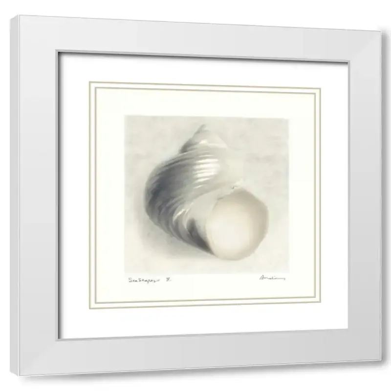
Image source: Bing (Web (fair-use with source credit))
Step-by-Step: From Floor Layout to Final Installation
You should never start by drilling holes into your wall. Begin by laying all your art pieces flat on the floor in front of the wall. This allows you to swap positions, test spacing, and see how the visual weight balances before you commit to any hardware.
Take a photo once you find an arrangement that feels right to use as a reference.
Create paper templates to finalize your plan. Trace your frames onto kraft paper or old newspapers and cut them out. Tape these templates to the wall using painter's tape, which will not damage your paint.
This step lets you check the height, spacing, and overall flow from a standing position. Once you are satisfied, install your hardware directly over the templates.
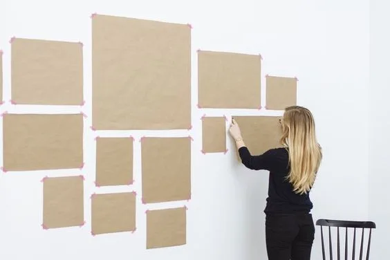
Image source: Bing (Web (fair-use with source credit))
Troubleshooting Common Gallery Wall Mistakes
The most frequent mistake involves failing to account for wall texture or substrate limitations before you start mounting art. Drywall, for instance, requires specific anchors to support heavier frames, or you risk the collection sagging over time. Check your wall surface type first.
If you use the wrong hardware, you might end up with damaged drywall that needs patching and repainting.
Another common pitfall is the drifting effect where individual pieces become uneven as they hang. This often happens when you use lightweight hardware that flexes under the weight of glass-fronted frames. Always use D-rings or heavy-duty French cleats for larger pieces to keep them flush against the wall.
If your art looks tilted, adjust the wire tension or add a small bump of adhesive putty to the bottom corner to hold it in place.
Spacing issues are the final culprit for an amateur look. If your gaps are inconsistent, the human eye immediately notices the lack of precision. Use a simple spacer tool or a piece of cardboard cut to your preferred width to keep every gap uniform.
Consistency is the secret to making a collection of mismatched styles look like an intentional unit.
Expert Tips for Sustaining Your Collection
A curated wall is never truly finished because your personal style will evolve. You can treat your collection as a living display that grows alongside your interests. If you find a new piece that does not fit, consider changing the frame to match your existing bridge rather than forcing the art to change.
This maintains the harmony of your display while allowing you to add new treasures.
Keep an inventory of your hardware if you plan on rotating art frequently. Using the same type of hook or anchor system across the wall makes swapping pieces simple. When you need to update a piece, you won't have to drill new holes or patch old ones.
This long-term approach keeps your walls healthy and reduces the effort required to refresh your space.
Periodically check the stability of your frames, especially in high-traffic areas. Vibrations from doors closing can shift even the most secure artwork over time. A quick adjustment every few months keeps your display looking intentional and sharp.
Consistent maintenance ensures that your wall art remains a highlight of your home rather than a recurring source of frustration.
Frequently Asked Questions
Can I mix black and white photography with oil paintings?
Yes, you can mix these styles effectively by unifying them with a consistent frame style. If both the photography and the oil painting sit in matching dark wood or metal frames, the eye recognizes them as part of a set. This shared frame acts as the bridge that makes the transition between mediums feel deliberate.
How do I hang different sized frames together?
You should arrange them by placing the largest piece slightly off-center to act as a visual anchor. Smaller pieces should then fill the surrounding space, maintaining equal gaps between them to provide structure. The goal is to distribute visual weight across the wall so that one side does not feel heavier than the other.
What is the best way to avoid damaging my walls?
Use adhesive hanging strips or small, non-marring picture hangers to protect your wall surface. These are especially effective for smaller, lighter frames that do not require heavy-duty wall anchors. If you must use nails, patch kits are readily available to hide the holes if you ever decide to rearrange your collection.
Do all pieces in a gallery wall need to be centered at the same height?
The centers of all pieces do not need to align perfectly if the overall collection has a defined boundary. However, keeping the center of the total arrangement at the standard 57-inch mark creates a sense of stability. Within that group, varying the heights of individual pieces adds a dynamic, professional feel to the layout.