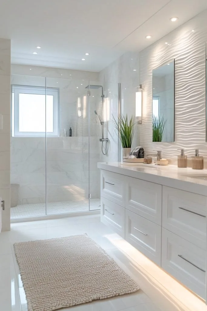
How to Match Furniture With Wall Colors
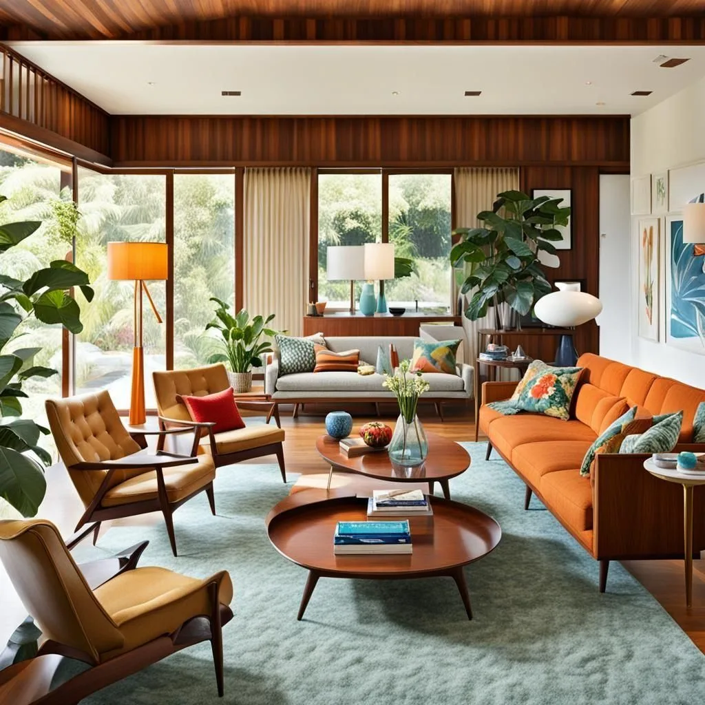
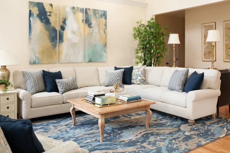
Image source: Web (Bing) / pinterest.com (Web image (fair-use with source credit))
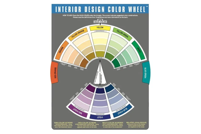
Learning how to match furniture with wall colors begins with observing the natural light in your home. Colors often behave differently when they are applied to vertical wall surfaces versus horizontal furniture upholstery.
Industry standards, such as those discussed by the National Institute of Standards and Technology, confirm that light reflection and color perception change based on the angle and source of illumination. You can create a cohesive space by focusing on the relationship between your walls and your furniture.
Quick Answer
Matching furniture to walls requires balancing undertones and lighting. Use the sixty-thirty-ten color ratio for visual stability. Test all fabric swatches against your specific wall paint.
Consistent color temperatures create a unified room appearance. Always view samples under natural and artificial light sources.
Why Your Room Doesn't Feel Finished (The Visual Truth)
Rooms often feel incomplete because the furniture and walls lack a shared design language. You might have a beautiful sofa and a fresh coat of paint, but they clash if their undertones conflict. This disconnect creates a sense of visual noise that prevents a room from feeling cohesive.
The human eye naturally seeks balance in an interior environment. When the furniture color is too aggressive compared to the wall, the room loses its grounding. You can resolve this by ensuring your primary pieces share at least one common color note with your wall treatment.
If your space feels chaotic, look for a bridge element. This could be an area rug or a set of curtains that ties the wall hue to the furniture fabric. Small adjustments in these secondary items often solve the problem without needing to buy new furniture.
Decoding Color Undertones and Light Exposure
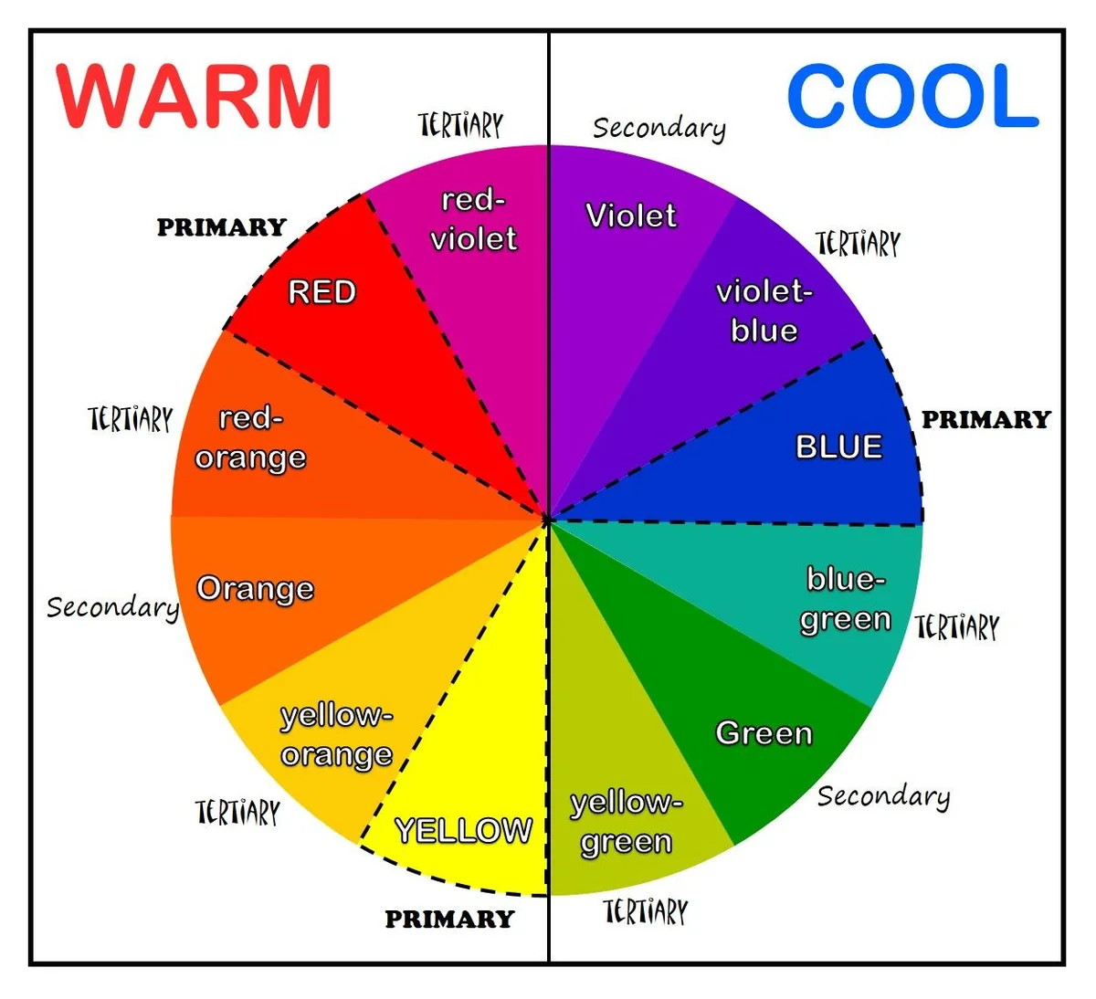
Image source: Web (Bing) / pinterest.co.uk (Web image (fair-use with source credit))
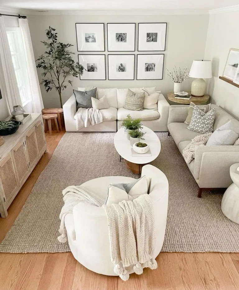
Every wall color possesses an undertone that dictates how it relates to other items. A grey wall might lean blue, green, or purple. If your furniture choice has a conflicting undertone, the result is a visible clash even if the main colors seem to match.
Light exposure changes how these undertones read throughout the day. North-facing rooms often receive cooler, bluish light that can make soft tones appear grey or muted. South-facing rooms typically get intense, warm light that brightens colors and highlights yellow or orange base notes.
- Cool Undertones: Best paired with crisp whites or deep blues for a professional look.
- Warm Undertones: Pair well with earth tones, creams, and rich wood grains.
- Neutral Undertones: The most flexible option, working well with almost any furniture style.
Always evaluate your wall color and furniture fabric at different times of the day. Artificial lighting, such as incandescent versus LED bulbs, also alters the appearance of color. As of 2026, many design professionals suggest using high-CRI bulbs to ensure your furniture colors look as intended.
The 60-30-10 Rule for Visual Balance
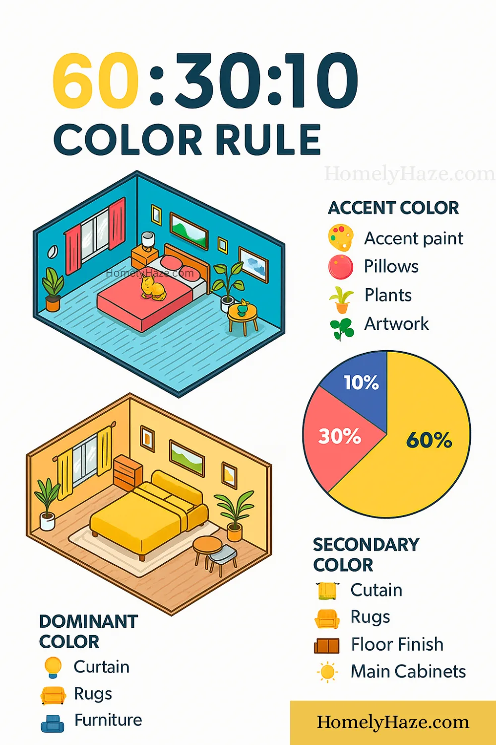
Image source: Bing (Web (fair-use with source credit))
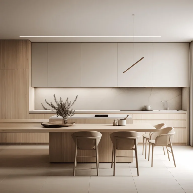
The 60-30-10 rule provides a straightforward formula for distributing color throughout a room. This method ensures that your wall color and furniture don't compete for dominance. It creates a hierarchy that guides the eye naturally across the space.
Your walls typically occupy the 60 percent portion of your color palette. The main furniture pieces, such as a sofa or an armoire, generally fill the 30 percent. The remaining 10 percent is reserved for accent items like throw pillows, art, or small decor pieces.
| Category | Typical Allocation | Goal |
|---|---|---|
| Walls | 60% | Create the room's base atmosphere. |
| Furniture | 30% | Add depth and provide secondary focus. |
| Accents | 10% | Introduce pops of personality or contrast. |
This ratio is a guideline rather than a rigid law. You can adapt it by swapping the wall and furniture percentages if you prefer a darker, more dramatic look. The goal is to avoid having all elements fighting for equal attention.
Choosing Your Aesthetic: Monochromatic vs. High-Contrast
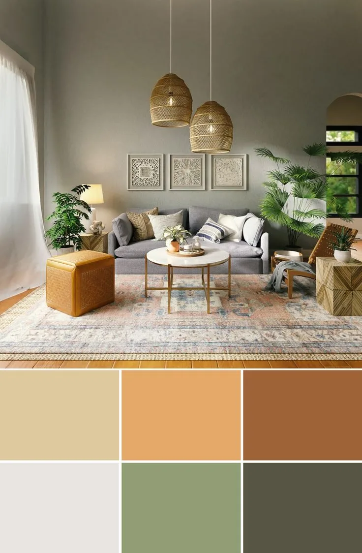
Choosing a color strategy depends on how much movement you want to see in the room. A monochromatic approach relies on using different shades, tints, and textures of the same color. This method is excellent for small spaces because it blurs the edges of the room to make it feel larger.
High-contrast designs use opposing colors to define zones and create energy. This is a bold choice for dining rooms or areas where you want to highlight specific furniture silhouettes. It requires a more careful eye to ensure the transition between the wall and the furniture remains intentional.
- Monochromatic: Select a wall color and find furniture that is two or three shades darker or lighter.
- High-Contrast: Pair dark, moody walls with light, neutral furniture to make pieces pop.
- Balanced Contrast: Use a mid-tone wall with furniture that features complementary accent piping or trim.
Consider the maintenance level of your chosen aesthetic. Light furniture against high-contrast dark walls shows every speck of dust or pet hair. Choose durable, high-performance fabrics if you prefer a high-contrast style that requires frequent cleaning.
Essential Steps for Testing Swatches and Materials
Never purchase expensive furniture based on a screen image or a tiny paint chip. Texture plays a major role in how light interacts with furniture surfaces. A velvet sofa will appear darker and deeper than a linen sofa of the exact same color.
Start by obtaining a large paint swatch and a fabric sample. Tape the paint to the wall and place the fabric sample on a board near the wall. View these samples in your specific room at three different times during the day.
- Morning Light: Check for cool, bright shifts in color.
- Midday Light: Look for the most accurate color representation.
- Evening/Artificial Light: Observe how the furniture looks under your lamp or overhead light.
If the fabric sample starts to look dull or muddy under your evening lighting, you may need a different furniture shade. It is also wise to consider the material finish of your walls. A matte paint finish absorbs more light, while a satin or semi-gloss finish will reflect more light onto your furniture surfaces.
Common Design Traps and How to Fix Them
The most frequent mistake is ignoring the impact of reflective surfaces on color perception. You might choose a sofa that looks perfect in the showroom, but under your specific home lighting, it takes on a sickly green or muddy grey hue. This phenomenon, known as metamerism, occurs because your home lighting lacks the full spectrum of light found in a controlled retail environment.
Another trap involves ignoring the visual weight of your furniture relative to the wall color. Placing a massive, dark piece of furniture against a dark wall often creates a void where the furniture loses its definition. You can fix this by introducing high-contrast textures or metallic accents that catch light and break up the solid color block.
- Forgetting Trim: If your wall color is deep, consider the trim. Using a crisp white or a contrasting color provides a frame for the room.
- Scale Mismatch: Overloading a small, light-walled room with dark, heavy furniture creates a cramped feeling. Balance large dark pieces with airy, leggy furniture to keep the floor visible.
- Ignoring Floor Space: Your floor is the largest neutral surface in the room. Ensure your rug connects the furniture color to the wall color rather than fighting both.
If you find that your furniture simply does not work with your wall color, you don't necessarily need to repaint. Adding textile layers like oversized throw blankets or decorative pillows can bridge the gap. These accessories act as a transition palette that ties disparate hues together.
Frequently Asked Questions About Furniture-Wall Coordination
How do I match furniture if my walls are neutral?
Neutral walls provide the ultimate blank canvas for your furniture choices. You can opt for high-contrast furniture to create a focal point, or keep the room monochromatic for a serene, minimalist look. Since neutrals don't carry strong undertones, you have more freedom to experiment with textures like velvet, leather, or linen to add visual interest.
What should I do if my furniture color looks different at night?
This is a standard result of lower light levels affecting color saturation. If you love the furniture by day but dislike it at night, add localized ambient lighting. Floor lamps with warmer-toned bulbs can stabilize the color appearance during the evening hours.
Always check your samples under the exact type of bulb you intend to use in the finished space.
Can I mix wood tones with my wall color?
Yes, you can mix different wood tones as long as you maintain a consistent temperature. If your walls have cool undertones, try to group wood furniture that has an ash or grey-wash finish. For walls with warm undertones, mahogany, oak, or cherry woods will feel much more at home.
Does the wall finish affect how furniture looks?
Yes, the sheen of your paint directly impacts the atmosphere of the room. A flat or matte paint finish absorbs light, making colors appear deeper and more muted. A semi-gloss or high-gloss finish reflects light, which can make furniture colors look more intense and vibrant.
Consider a satin finish for the best middle ground between durability and soft light reflection.
When should I choose a statement furniture piece?
A statement piece works best when the surrounding walls are kept in a neutral or muted tone. Let the furniture act as the anchor for the 60-30-10 rule by making it the primary focal point of the space. Keep the walls, rugs, and curtains secondary to ensure the room stays balanced rather than cluttered.