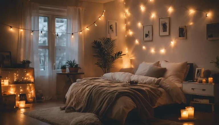
How to Choose Bedroom Colors
Deciding how to choose bedroom colors often feels like a guessing game. You might love a swatch in the store only to find it looks completely different on your walls. A successful paint project starts by analyzing your specific light conditions rather than just following trends.
Most people overlook how much natural light dictates the final result. According to technical documentation from the EPA, low-VOC paint options help maintain better indoor air quality during and after the application process. We will look at how to balance these practical needs with your personal aesthetic goals.
Quick Answer
Choose bedroom colors by analyzing your room's natural light orientation first. Use large paint samples to test hues at different times of day. Apply the 60-30-10 rule for a balanced and professional look.
Opt for low-VOC paints to ensure better indoor air quality while sleeping. Always prioritize your personal comfort over current interior design fads.
The Why Behind Bedroom Colors: It’s All About Your Light
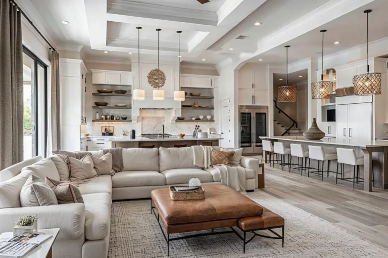
Choosing bedroom colors relies on understanding how light interacts with pigment. A color that looks soft and neutral in a showroom can turn aggressive or muddy once it hits your specific wall. You must view paint as a filter for light, not just a surface coating.
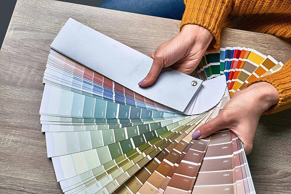
Image source: Web (Bing) / pngtree.com (Web image (fair-use with source credit))
Many people struggle because they ignore their room's orientation. The direction your window faces determines the intensity and temperature of the light entering your space. A cool-toned room needs different pigments than a space flooded with intense southern sun.
Step 1: Mapping Your Room’s Natural Light
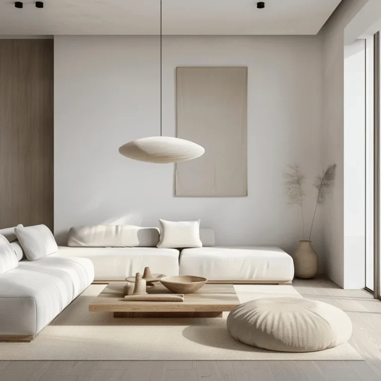
To determine how a color will behave, you have to identify where your light comes from. North-facing rooms receive cool, consistent light throughout the day. Using cool blue or grey in these rooms often makes the space feel clinical or cold.
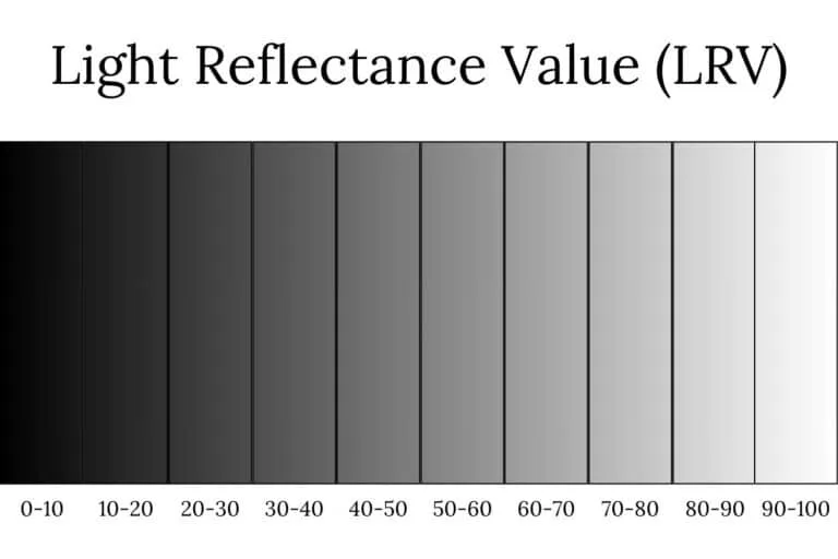
Image source: Web (Bing) / welshdesignstudio.com (Web image (fair-use with source credit))
- North-Facing: Use warm, earthy tones to counteract the lack of direct sunlight.
- South-Facing: These rooms can handle almost anything, including dark or bold colors.
- East/West-Facing: Your color will shift significantly from sunrise to sunset.
Test your samples at 9:00 AM, 2:00 PM, and 8:00 PM. This confirms if the hue holds its character or shifts in ways you dislike. Understanding your light orientation prevents the common mistake of picking a color that looks greyish or dead on the wall.
Step 2: Defining the Mood You Actually Need
Your bedroom serves a primary function that should guide your palette. If you struggle with sleep, you might want to avoid high-energy, saturated colors. Research into color psychology suggests that muted, low-arousal tones help lower the heart rate before bed.
| Mood Goal | Color Palette | Impact on Space |
|---|---|---|
| Restful | Sage, soft blue, lavender | Calms the nervous system |
| Cozy | Warm cream, terracotta, beige | Feels intimate and warm |
| Sophisticated | Deep navy, charcoal, plum | Creates a dramatic retreat |
Think about how you use the room outside of sleeping. If you spend time reading or relaxing, choose colors that feel grounding. Your color choice should create a buffer between the busy outside world and your personal quiet time.
Step 3: The Science of Sampling Before You Buy
Never rely on a printed paint chip to make your final decision. Paint chips lack the depth and texture of actual wall paint applied to a large surface area. The interaction between the paint's Light Reflectance Value and your specific wall texture is vital to the final look.
- Purchase at least two sample pots of your top choices.
- Paint a large square directly on the wall or on a piece of poster board.
- Place the sample near your existing furniture or textiles to check for harmony.
- Observe the color under both natural light and your actual bedside lamps.
This step saves time and money by preventing "repainting syndrome" where you have to buy a second gallon. You will often find that a color looks fantastic in the store but feels completely wrong when viewed against your specific flooring.
The 60-30-10 Workflow: Balancing Your Palette
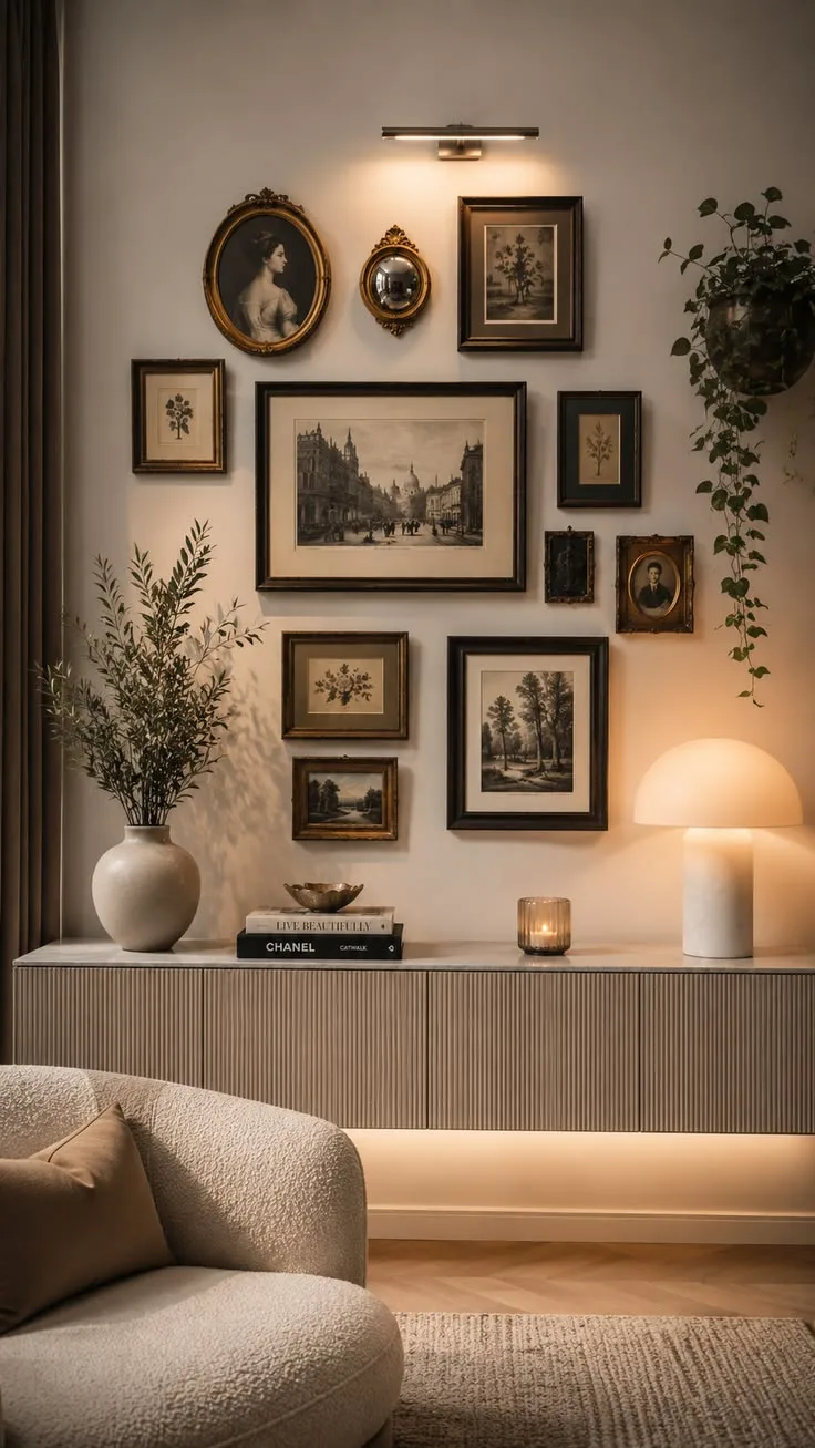
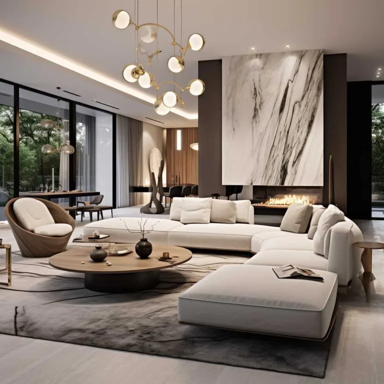
The 60-30-10 rule provides a reliable framework for layering color. This professional design principle prevents a room from looking monotonous or too chaotic. It ensures that your main wall color, furniture, and accent items work in harmony.
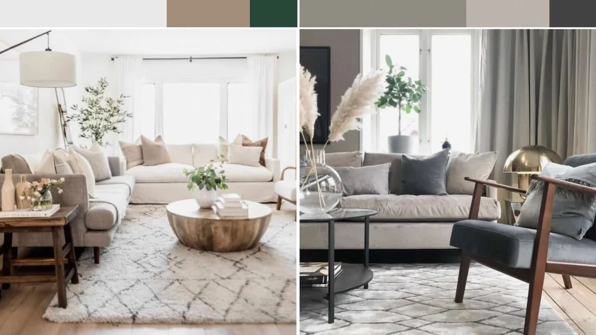
Image source: Web (Bing) / designtastemaker.com (Web image (fair-use with source credit))
- 60% Primary Color: This is usually your walls. Choose a soft, neutral, or base color that sets the tone.
- 30% Secondary Color: This includes curtains, rugs, or large furniture pieces. It adds depth to the room.
- 10% Accent Color: Use this for throw pillows, art, or lamps. It provides the pop of personality without overwhelming the space.
Following this workflow creates a visual hierarchy. It makes the room feel intentional and curated rather than accidental. When you use this structure, you don't have to guess if your accessories will match your walls.
Common Pitfalls: Why Your Paint Looks Different on the Wall
Metamerism is the most frequent culprit when a color looks perfect in a store but wrong at home. This phenomenon happens when a color reflects different wavelengths under artificial light compared to natural daylight. Your choice of light bulb also plays a massive role in how the pigment appears to your eye.
Warm-toned bulbs, or those with a low Kelvin rating, will pull the yellow out of your wall color. Cool-toned or daylight bulbs will emphasize blue and grey undertones, often making a space feel sterile. Always test your paint samples while your bedroom lights are actually on.
Don't ignore the impact of surrounding colors like your flooring or window treatments. A neutral grey wall can look purple if your carpet has red undertones. Take a piece of your flooring or bedding to the paint store to ensure the undertones play nice together.
Expert Tips for Longevity and Indoor Air Quality
Selecting high-quality paint saves you from the frustration of constant touch-ups. Opt for products labeled as low-VOC or zero-VOC to minimize chemical off-gassing in your sleeping area. These paints meet stricter air quality standards and reduce the presence of volatile organic compounds that can linger in a closed bedroom.
Preparation remains the secret to a professional finish that lasts. Always use a high-quality primer if you are covering a dark color with a lighter shade. This ensures the true hue of your selected color comes through without multiple extra coats.
Think about the sheen level when you select your product. Eggshell or matte finishes are standard for bedrooms because they don't reflect glare when you are trying to wind down. Higher gloss paints attract attention to imperfections in your drywall and can be distracting under bright overhead lighting.
Frequently Asked Questions About Bedroom Colors
Should I paint the ceiling a different color than the walls?
Painting your ceiling the same color as the walls creates a seamless, immersive feeling. This is especially helpful in smaller bedrooms because it eliminates visual breaks at the corners. If you want to make a room feel taller, use a slightly lighter shade of the wall color on the ceiling.
How many coats of paint are usually needed for a bedroom?
Most quality paints require two full coats to achieve the manufacturer-stated color accuracy. If you are making a drastic change, such as going from black to white, you might need a dedicated tinted primer first. Always allow the first coat to dry completely before applying the second.
Can I mix warm and cool colors in the same bedroom?
You can mix warm and cool colors if you establish a clear dominant temperature. Use a dominant cool color for the walls and warm accents to add comfort, or vice-versa. This balance prevents the room from feeling flat while keeping the overall mood intentional and cozy.
How do I know if a color is too dark for my small room?
No color is strictly forbidden in a small room, but dark shades require excellent lighting to avoid feeling like a cave. If you love a moody navy or charcoal, ensure you have multiple layers of warm lighting to add depth. Dark colors can actually add a sophisticated, cozy vibe to a compact sleeping space.
When should I choose wallpaper instead of paint?
Choose wallpaper when you want to add specific texture, pattern, or a sense of luxury that paint cannot replicate. Wallpaper is excellent for creating a focal wall behind your bed. Remember that it is harder to change than paint, so ensure you truly love the pattern before committing to the full space.